
Abstract Botanical Print: Earthy Tropical Wildflower Art for Organic, Collected Interiors
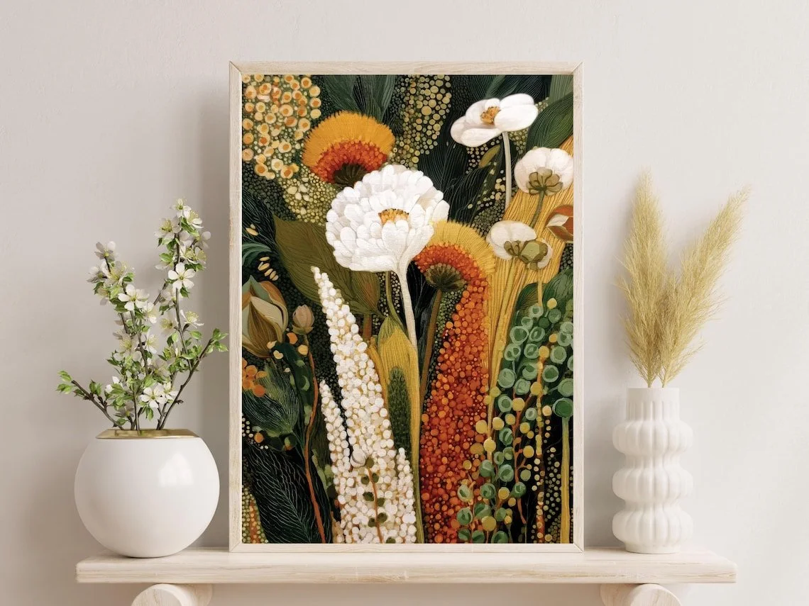
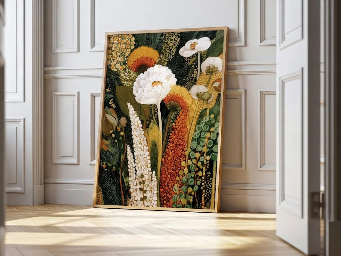
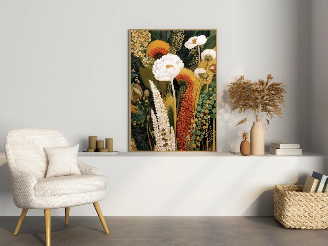
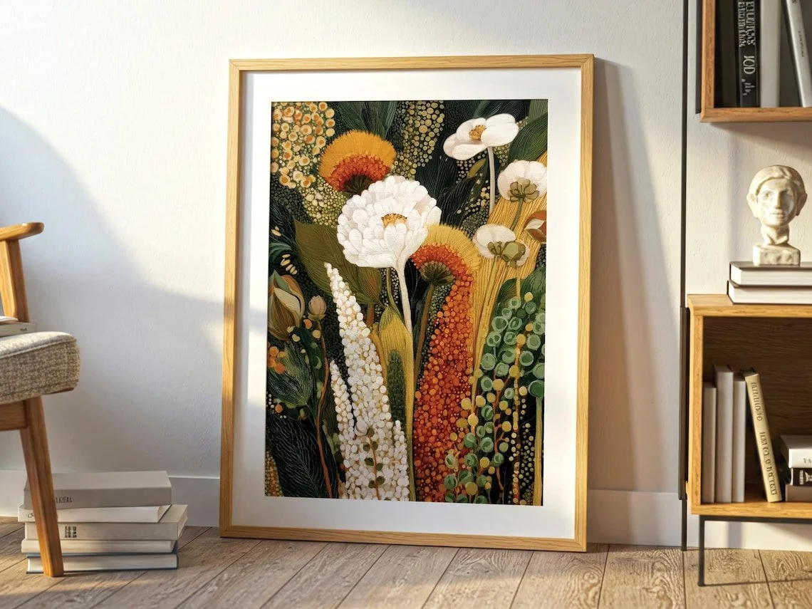
There is a particular appeal to botanical art that does not try to reproduce nature literally. Instead of presenting flowers as a precise scientific study, abstract botanical work can reduce leaves, seed pods, blooms, and organic textures into shapes, colors, and patterns. The result feels less like a traditional floral illustration and more like a visual interpretation of the natural world.
The “Abstract Botanical Print: Earthy Tropical Wildflower Art, Boho Kusama Home Decor” from MoonAndTheMeadows takes that approach through a layered composition of wildflowers, leaves, seed pods, and abstract textures. The palette centers on warm browns, greens, ochre, and ivory, creating an earthy character that feels naturally suited to interiors built around wood, woven materials, neutral walls, and vintage-inspired accents.
The listing identifies the artwork as a made-to-order paper print rather than an original painting, with the artwork designed in Cologne, Germany and printed locally through production partners in multiple regions.
What Makes This Piece Stand Out?
The strongest feature of this work is its relationship between botanical subject matter and pattern.
Rather than relying on a single oversized flower as the focal point, the artwork brings together several natural motifs—wildflowers, foliage, seed pods, and abstract textural elements. According to the listing, those elements are combined to evoke the complexity of nature while maintaining a strongly decorative composition.
That distinction matters when considering wall art for an interior. A purely illustrative botanical print often reads as delicate and quiet. This piece has more visual density. The combination of organic forms and patterned areas gives the eye several points of interest, making it capable of holding its own on a relatively open wall.
The color story is equally important. Warm brown and ochre tones bring visual warmth, while greens introduce the natural quality expected from botanical imagery. Ivory provides breathing room between the stronger tones. Together, the palette feels grounded rather than bright or highly saturated.
From an interior-design perspective, that makes the piece more adaptable than a botanical artwork built around vivid pinks, blues, or tropical greens.
The Materials and Craftsmanship
The listing specifies paper as the material and describes the piece as a made-to-order print. It is produced on premium matte paper with a soft-touch, non-reflective surface. The paper is listed as 200 gsm (80 lb) with a thickness of 0.26 mm, and the seller states that the paper has a matte, uncoated white surface and is FSC-certified or equivalent for sustainability.
The matte surface is particularly relevant to how this type of artwork behaves inside a room. Because the finish is non-reflective, the visual emphasis remains on the artwork's colors and patterns rather than on glare from nearby windows or artificial lighting.
The seller also explains that the artwork is designed in Cologne and printed locally through trusted partners in locations including the United States, United Kingdom, European Union, and Australia. The print is then packaged for shipping through those production arrangements.
One other detail is worth noting: the listing states that the design was created with the assistance of advanced AI technology, combined with human creativity and design input.
That places the work within a growing category of contemporary decorative art where traditional botanical references are interpreted through digital design tools rather than conventional painting or drawing techniques.
The artwork is sold as the print itself; the frame is not included. The framed and styled photographs on the listing are presentation examples rather than part of the item configuration.
How It Works With Different Interior Styles
This is the kind of artwork that naturally leans toward organic and relaxed interiors, but it does not have to be confined to one decorating style.
Boho Interiors
Bohemian rooms often rely on layered textures, natural materials, vintage accents, and an eclectic collection of objects. The earthy botanical palette fits naturally into that environment.
A woven rug, rattan furniture, textured cushions, ceramic accessories, or aged wood can reinforce the print's connection to nature without making the room feel overly coordinated.
Organic Modern
Organic modern spaces are usually more restrained. Think warm wood, soft neutral upholstery, stone, linen, and a limited color palette.
Here, the artwork can provide the visual complexity that the rest of the room intentionally avoids. Against a warm white or beige wall, the botanical forms introduce pattern without requiring a collection of competing decorative elements.
Scandinavian-Inspired Spaces
The print can also work in a Scandinavian-leaning room when the surrounding furniture remains simple.
Pairing it with pale wood, cream upholstery, soft gray textiles, and uncluttered surfaces allows the earthy colors to act as subtle accents. The key is to give the artwork enough visual space rather than surrounding it with too many decorative objects.
Rustic and Eclectic Rooms
The natural palette is particularly sympathetic to rustic interiors, especially those using reclaimed wood, woven baskets, vintage ceramics, and aged finishes.
In a more eclectic room, the artwork can become part of a larger collection of botanical, folk-inspired, or nature-themed pieces.
Where Could You Display It?
Living Room
The living room is perhaps the most flexible setting for this artwork.
Placed above a console, sideboard, or low-profile sofa, it can act as a central decorative element without demanding the entire room's attention. A particularly effective approach would be to repeat one or two of its earthy tones elsewhere through cushions, ceramics, a rug, or small decorative objects.
Bedroom
The softer side of the palette makes the print a natural candidate for a bedroom, especially one built around warm neutrals and natural textures.
Rather than placing it among numerous small decorations, consider allowing it to occupy a relatively quiet wall so that the composition remains easy to appreciate.
Reading Nook
The seller specifically identifies a sunlit reading nook as a suitable setting, and that makes sense from an interior perspective. The botanical imagery reinforces the connection to nature, while the earthy palette works comfortably alongside wood, linen, and woven furniture.
Entryway
An entryway can also benefit from artwork with a strong organic identity. Hung above a slim console or bench, the print can establish the visual tone of the home before the visitor reaches the main living spaces.
How to Style It
The easiest way to style this artwork is to let its natural palette lead the room.
Warm off-whites, sand, beige, muted brown, olive, and soft green are obvious companions. Ochre or deeper terracotta tones can be introduced as smaller accents rather than used in large blocks.
Furniture made from oak, walnut-toned wood, cane, rattan, or other natural-looking materials can echo the artwork's botanical character. Textiles with visible weave or soft irregular textures can also help connect the artwork to the rest of the room.
Lighting should remain relatively warm and comfortable. The matte paper helps minimize reflections, but positioning the artwork away from harsh direct glare will still make its subtler colors easier to appreciate.
Most importantly, avoid creating too much visual competition around it. Because the composition already contains multiple botanical forms and textures, the surrounding wall can benefit from some negative space.
A simple frame can be especially effective. Since the listing does not include a frame, the choice can be treated as part of the interior styling rather than as a fixed part of the artwork. A light wood frame would emphasize the natural character of the palette, while a darker frame could create a stronger boundary and a more graphic presentation.
Who Is This Piece For?
This artwork is likely to appeal to someone who prefers nature-inspired decoration with a more collected, artistic feel rather than highly polished or strongly minimalist wall art.
It makes sense for a person drawn to wildflower imagery, folk-art references, organic interiors, vintage textures, and slow-living aesthetics—the same design preferences highlighted in the listing itself.
It may also suit someone who wants botanical wall art without choosing a conventional photographic or hyper-realistic floral print. The abstract treatment gives the subject a more decorative character, allowing it to function as both an image of nature and a pattern within the room.
That balance is arguably the most interesting thing about the piece. It is botanical, but it does not need to feel traditionally botanical.
Final Thoughts
The appeal of this abstract wildflower print lies in its earthy color palette, layered botanical vocabulary, and pattern-driven interpretation of nature. Instead of relying on a single dramatic focal flower, it creates visual richness through the interaction of leaves, flowers, seed pods, and abstract textures.
Its strongest interior applications are likely to be rooms that already value natural materials, warm neutrals, and a relaxed sense of visual layering. In those environments, the artwork can add character without forcing the rest of the room to become overly decorative.
For anyone drawn to botanical imagery but looking for something less traditional, this piece offers an interesting middle ground: recognizable references to the natural world, interpreted through a contemporary decorative language.
Some links on this page may be affiliate links. If you make a purchase through one of these links, we may earn a small commission at no extra cost to you.
