
California Poppy Print: A Warm Botanical Accent for Contemporary Interiors
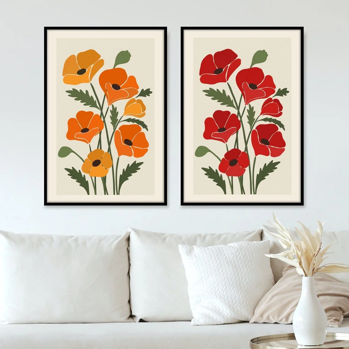
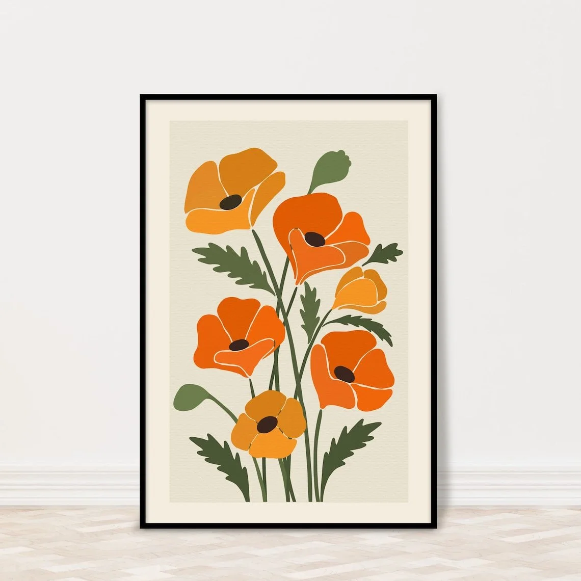
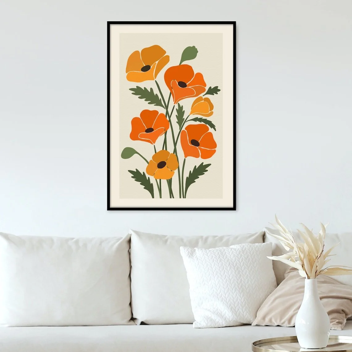
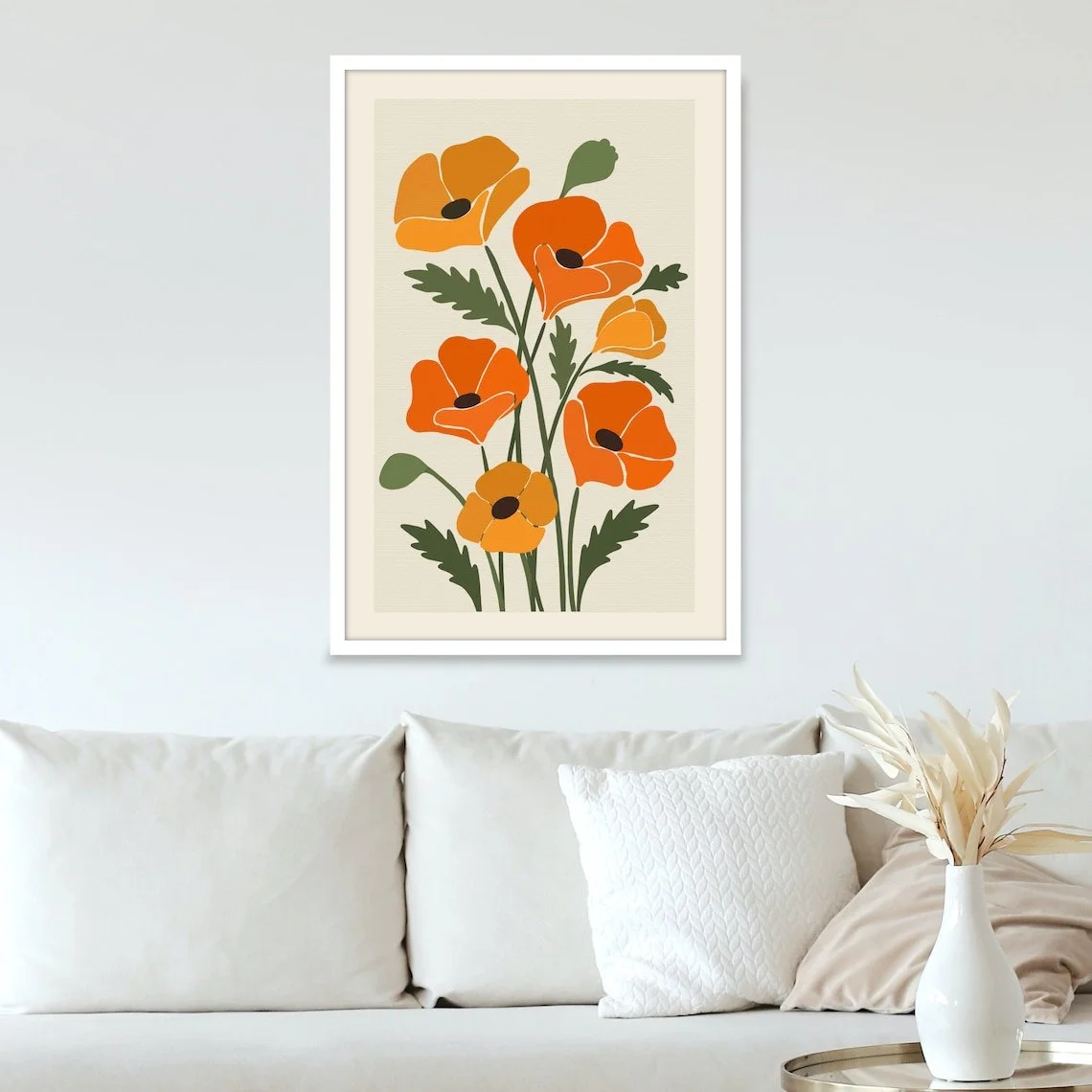
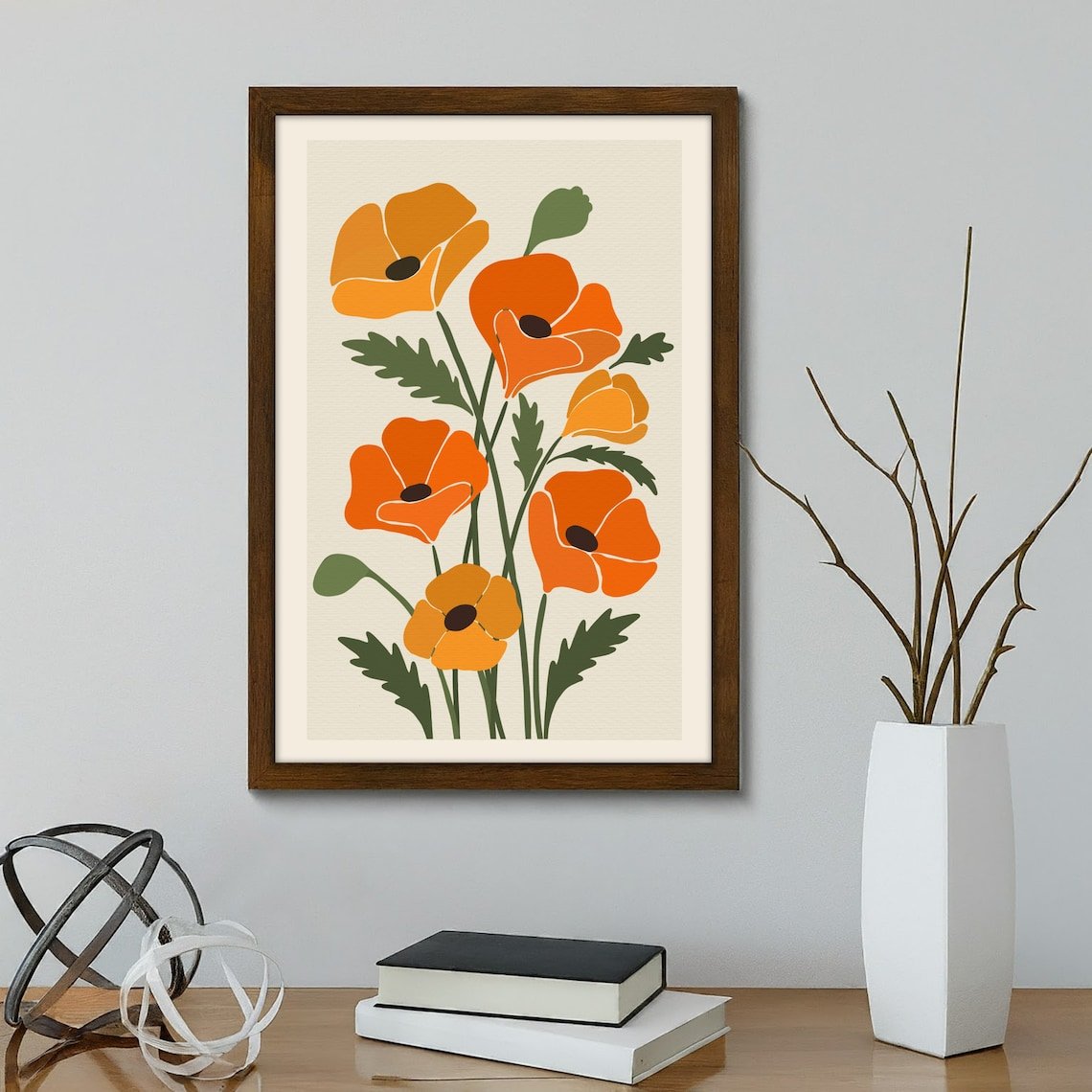
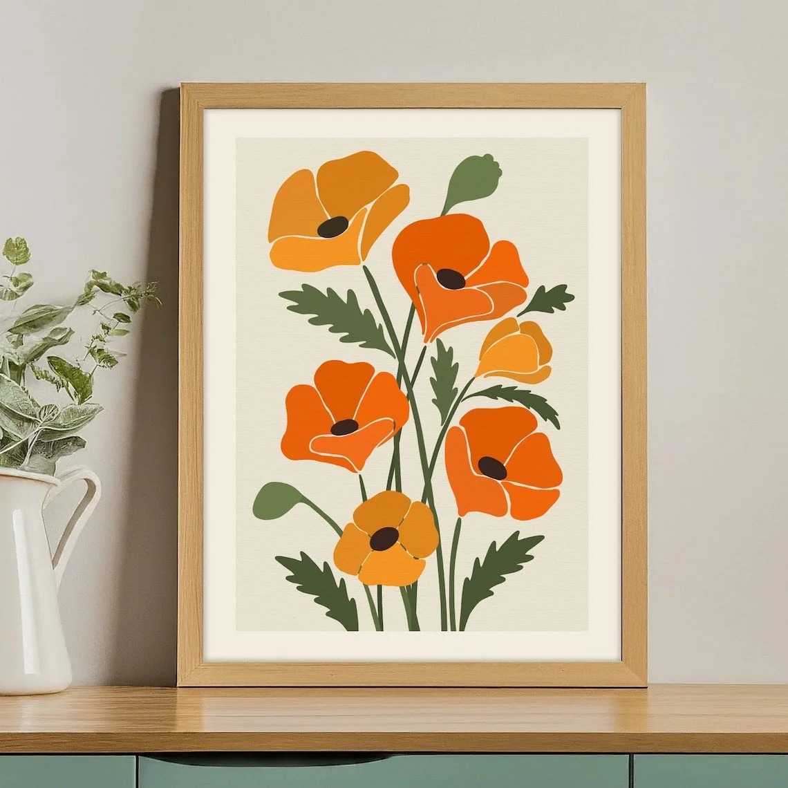
There is something quietly effective about botanical wall art: it can introduce color, nature, and a sense of softness without asking the room to revolve around it. This California Poppy print takes that approach through a simplified floral composition built around orange and yellow blooms, muted green foliage, and a warm, understated background.
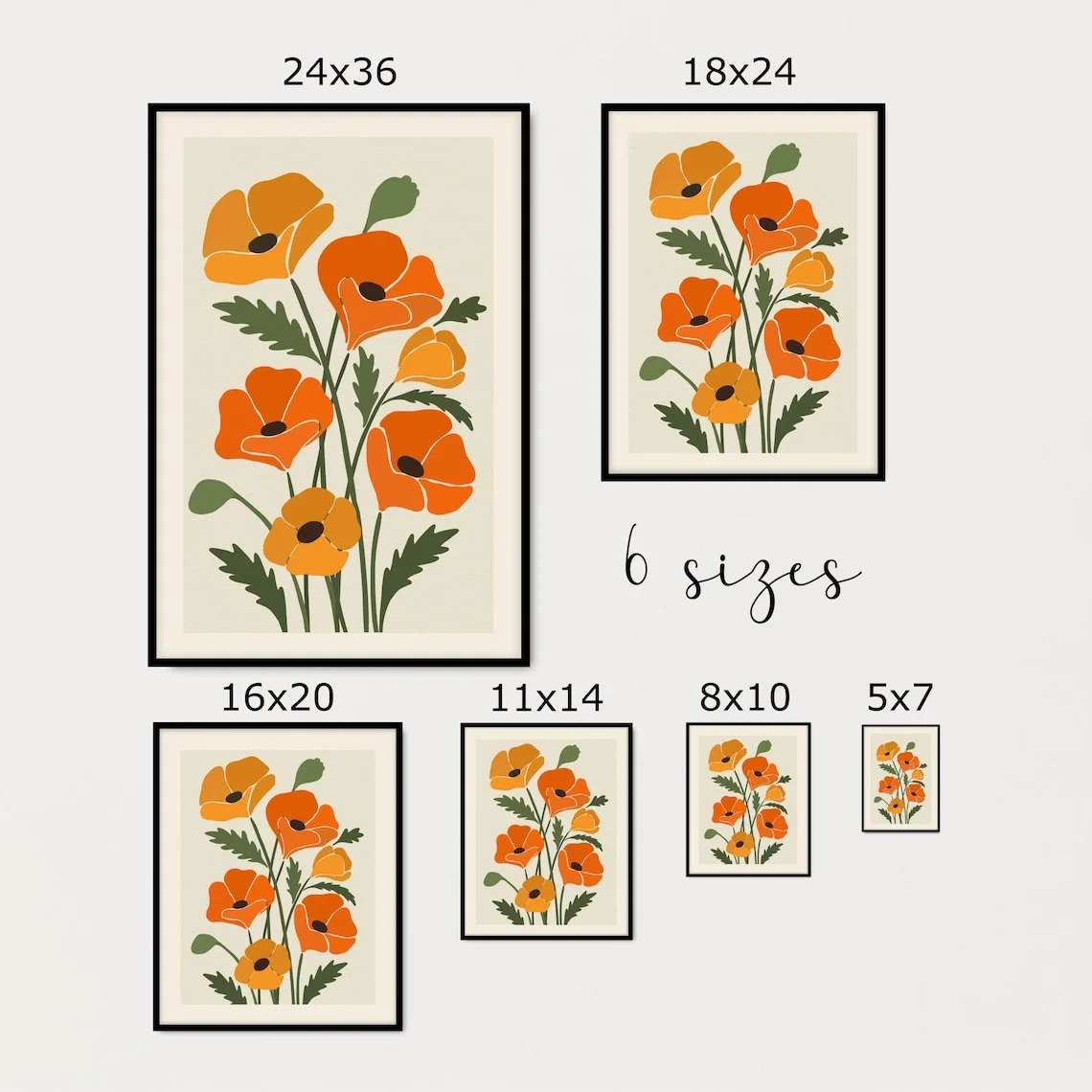
Designed by DashDecors, the piece is presented as a physical art print rather than an original painting. The listing describes it as a California poppy wall-art print produced on matte, museum-grade paper with pigmented archival inks. It is available in multiple size options and is supplied unframed, allowing the final presentation to be adapted to the interior around it.
What makes the artwork interesting from an interior-design perspective is not complexity, but balance. The floral shapes are expressive enough to bring life to a wall, while the limited palette and generous negative space keep the composition from feeling overly busy.
What Makes This Piece Stand Out?
At first glance, the strongest feature is its color relationship. The poppies are dominated by warm oranges and yellows, while the stems and leaves introduce a restrained green that prevents the composition from becoming overwhelmingly warm. The result is a palette with a distinctly botanical character but enough contrast to function as decorative wall art.
The artwork also benefits from its vertical arrangement. Rather than presenting a single oversized blossom, the composition gathers several flowers and stems into one upward-moving group. This creates a sense of height and makes the print particularly easy to imagine above a console, beside a cabinet, or on a relatively narrow section of wall.
Visually, the flowers have a simplified illustrated quality rather than the detailed realism of botanical photography. That gives the piece a more decorative, contemporary character. It can therefore work as an interpretation of nature rather than simply a literal depiction of it.
The soft background is equally important. In the product imagery, the pale neutral field gives the orange flowers room to breathe, allowing the brighter elements to remain the visual focus.
The Materials and Production
The listing identifies the artwork as a physical print made on 175 gsm museum-grade paper with a matte finish and pigmented archival inks. It is described as a print-on-demand product, and the seller states that the artwork is produced only after an order is placed. The listing also identifies a printing partner in Mission District, California.
This production method is worth considering because the character of a printed artwork is influenced not only by its image but also by the surface on which that image appears. A matte paper finish tends to support the understated quality of this particular composition, keeping reflections from competing with its colors when displayed indoors.
The print is sold without a frame, which is actually useful from an interior-design standpoint. Rather than being locked into a particular presentation, the artwork can be paired with a frame that reinforces the mood of the room.
The seller also offers optional personalization for adding the flower name or text to the lower-right portion of the print.
How It Works With Different Interior Styles
The California Poppy print has enough warmth to soften contemporary rooms, but its relatively restrained composition also allows it to move comfortably between several decorating styles.
Modern and Contemporary
In a modern interior, the orange and yellow flowers can act as a controlled accent against neutral walls, simple furniture, and clean architectural lines. A black, dark wood, or similarly understated frame could add definition without competing with the artwork.
The key is restraint. Because the flowers already supply color, the surrounding accessories do not need to repeat the palette excessively.
Organic Modern
This is arguably one of the most natural settings for the piece. Organic modern interiors often combine neutral materials with touches of greenery and warm natural tones. The botanical subject reinforces that connection to nature, while the illustrated quality keeps the artwork from feeling overly traditional.
Pairing it with light wood, linen upholstery, woven textures, or ceramic accessories could create a relaxed and cohesive environment.
Scandinavian
A Scandinavian-inspired room can also accommodate the print, particularly when the surrounding palette stays light. White, warm beige, pale wood, and soft gray can provide a calm backdrop, allowing the orange poppies to become the room's principal color accent.
Boho-Inspired Interiors
For a more expressive look, the artwork can work within a relaxed boho setting where natural textures, plants, textiles, and warm colors already play an important role. Here, the print becomes less of a single focal statement and more part of a layered, collected wall.
Where Could You Display It?
The product listing specifically suggests living rooms, dining rooms, kitchens, and areas above the bed. Those recommendations make sense because the artwork has a decorative character that can contribute warmth without requiring a highly formal setting.
Living Room
In a living room, the print could sit above a console, sideboard, or small reading area. Against a neutral wall, its orange flowers can provide a noticeable but relatively contained injection of color.
Dining Room
The botanical subject is particularly well suited to dining spaces, where floral artwork can add visual softness without feeling overly intimate or bedroom-oriented. It could sit above a sideboard or on a wall opposite the dining table.
Kitchen
The warm botanical palette can also suit kitchens with white, cream, natural wood, or muted green cabinetry. A carefully chosen frame can help the print feel integrated into the room rather than simply attached to an empty wall.
Bedroom
Above a bed, the artwork can introduce a gentle natural theme while remaining more structured than a large gallery wall. The lighter background can also help preserve a calm visual atmosphere.
Entryway
An entryway is another possibility, especially when the print is used above a narrow console or bench. The vertical composition can complement the proportions of many entry spaces.
How to Style It
The easiest way to style this artwork is to let its existing color palette guide the rest of the room without copying it too literally.
Warm white, cream, beige, muted sage, and natural wood are particularly compatible supporting tones. Orange can then appear sparingly through a cushion, ceramic object, textile, or small decorative accent.
Frame choice can have a significant effect on the overall impression. A slim dark frame could emphasize the graphic quality of the flowers, while a natural wood frame could move the artwork toward a softer, more organic presentation. A light frame would create a quieter transition between the pale background of the print and a similarly light wall.
Lighting matters too. Since the print has a matte finish, it can be positioned where the artwork remains clearly visible without relying on intense direct illumination. A nearby wall light or soft ambient lighting can help bring out the contrast between the warm flowers and green foliage.
One of the most important styling decisions, however, is negative space. The artwork has enough visual information to stand on its own, so surrounding it with too many similarly colorful decorative pieces could reduce its impact. Giving it breathing room is likely to produce a more intentional result.
Who Is This Piece For?
This artwork will naturally appeal to someone who enjoys botanical imagery but prefers a cleaner, more illustrative treatment than traditional botanical paintings.
It may also suit interiors that need a little warmth without introducing a complicated pattern. The orange-and-green palette offers a straightforward way to bring nature-inspired color into an otherwise neutral room.
For someone interested specifically in California's visual identity, the subject adds another layer of meaning: the California poppy is presented here as both a floral subject and a recognizable regional symbol. The listing explicitly describes it as California's state flower.
What makes the piece appealing, then, is less about grandeur and more about atmosphere. It combines recognizable natural imagery with a simplified decorative language that can settle comfortably into a contemporary home.
Final Thoughts
The California Poppy print is a good example of how botanical wall art can be colorful without becoming overwhelming. Its orange and yellow flowers provide the energy, while the green foliage and pale background create enough visual quiet for the composition to remain balanced.
Its unframed format also leaves room for interpretation. Rather than prescribing one finished look, the artwork can be adapted through frame selection, placement, and the colors already present in the room.
For interiors built around warm neutrals, natural materials, or restrained contemporary styling, the print offers an approachable way to introduce floral character and a touch of California-inspired color.
Some links on this page may be affiliate links. If you make a purchase through one of these links, we may earn a small commission at no extra cost to you.
