
Red Lily Print: A Graphic Floral Accent for Contemporary Interiors
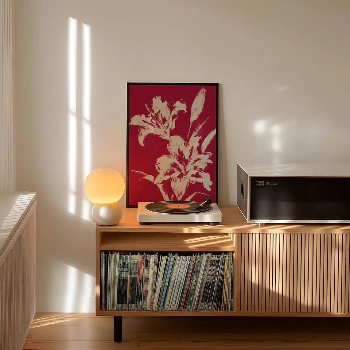
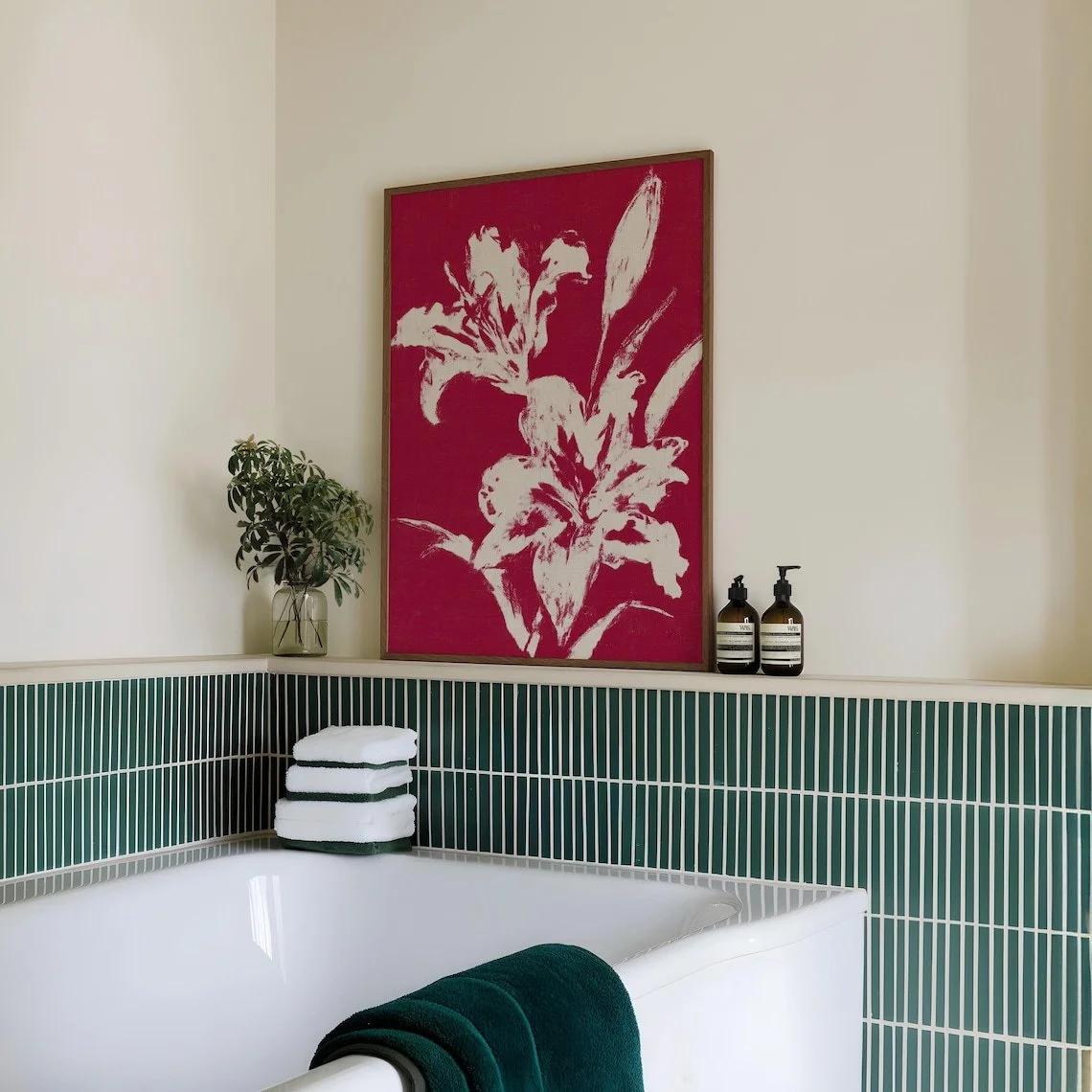
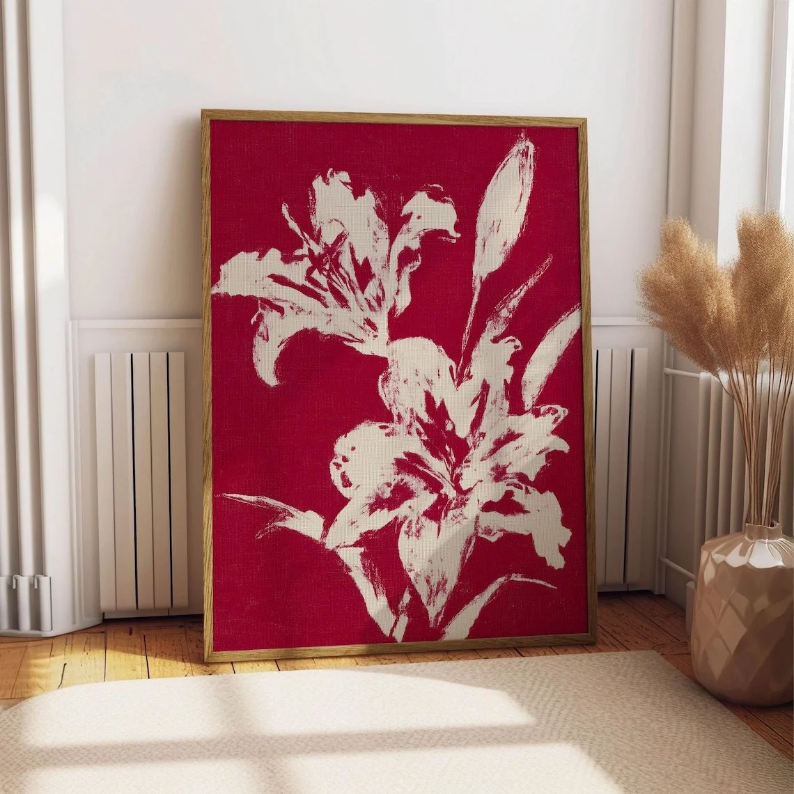
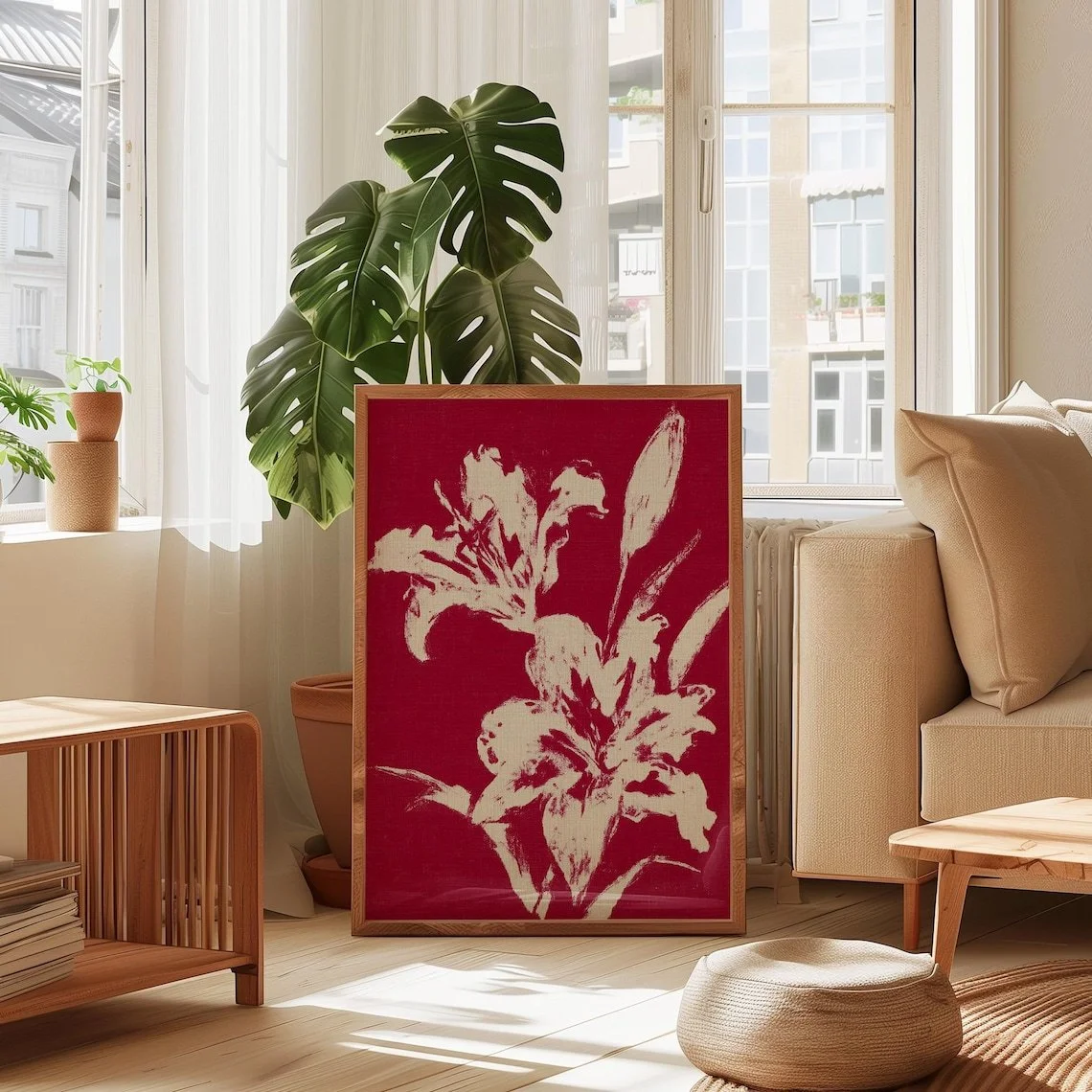
There is something particularly effective about floral art when it steps away from delicate botanical realism and embraces a stronger graphic language. This Red Lily Print takes that approach, presenting the flower as a bold botanical subject rather than a traditionally soft floral composition. The result is a piece that feels expressive and decorative while retaining the recognizable structure of a lily.
The artwork is presented as a red lily print described on Etsy as a bold floral wall art piece with vintage, crimson, maximalist, and woodblock-inspired qualities.
What Makes This Piece Stand Out?
The most immediate characteristic is its use of red as the dominant visual note. Rather than allowing the flower to blend quietly into the background, the crimson-red lines give the composition a clear presence. The botanical subject is simplified into expressive forms, allowing the petals, stems, and leaves to read almost like a hand-rendered illustration.
Visually, the piece sits somewhere between botanical illustration and graphic floral artwork. The lily is recognizable, but its treatment is more stylized than photographic. That distinction is important because it gives the artwork greater versatility: it can participate in an interior as a decorative graphic element rather than functioning only as a literal image of a flower.
The composition also benefits from the contrast between the strong floral forms and the relatively restrained surrounding space. In the product imagery associated with this artwork, the red floral drawing is presented against a pale green field with a light border and a warm-toned wooden frame, creating a balanced relationship between saturated red and quieter neutral or muted tones.
The result is an artwork with personality without requiring an overly complicated visual arrangement.
A Graphic Approach to Botanical Art
What makes botanical wall art interesting in contemporary interiors is often not the subject itself, but the way the subject is interpreted.
Here, the lily is treated almost as a collection of lines and shapes. The elongated stem creates movement through the vertical composition, while the open petals provide larger areas of visual weight. Smaller botanical details around the blossoms keep the image from feeling overly rigid.
That graphic quality makes the piece particularly interesting in interiors where artwork is expected to contribute structure as well as color.
It can act as a visual counterpoint to furniture with simple silhouettes, especially when the surrounding room relies heavily on clean horizontal or vertical lines.
How It Works With Different Interior Styles
This artwork could comfortably move between several decorative directions, particularly where strong color and organic motifs are welcome.
Contemporary Interiors
A contemporary room with restrained furniture can provide an excellent setting for the print. Against white, cream, light gray, or warm neutral walls, the red floral elements can become the main source of visual energy.
The key is restraint elsewhere. A simple sofa, streamlined shelving, or understated console allows the artwork to remain visually distinctive without competing with too many decorative objects.
Eclectic and Maximalist Spaces
The artwork's stronger red presence and vintage-inspired botanical character make it a natural candidate for more expressive interiors. In a maximalist setting, it could be paired with patterned textiles, darker woods, burgundy accents, or other botanical references.
Here, the print does not need to stand alone. It can become part of a layered visual story.
Organic Modern
The botanical subject also lends itself well to organic-modern interiors, particularly when combined with natural wood, woven textures, linen, stone, and warm neutrals.
This approach would soften the intensity of the red while allowing the artwork's organic subject to feel connected to the broader material palette of the room.
Scandinavian-Inspired Rooms
A more restrained Scandinavian setting can work too. Against pale walls and light wood, the artwork can introduce a carefully controlled dose of warmer color.
Rather than filling the room with decorative objects, the print can serve as one concentrated visual accent.
Where Could You Display It?
The vertical floral format makes the artwork particularly suitable for areas where wall height can be emphasized.
Living Room
In a living room, it could work above a compact console, beside a bookshelf, or as part of a carefully spaced gallery arrangement. It would be particularly effective when the surrounding furniture stays relatively quiet in color.
A cream sofa with warm wood, for example, would allow the red floral element to become an intentional accent rather than simply another color in the room.
Bedroom
The expressive floral subject can also bring warmth to a bedroom. A neutral headboard, natural bedding, and a few restrained red or burgundy details could create a cohesive palette without making the room feel overly coordinated.
The artwork is especially interesting for bedrooms that lean toward vintage, eclectic, or contemporary botanical styling.
Entryway
An entryway often benefits from artwork with an immediate visual identity. The red lily can provide that moment of interest without requiring a large collection of decorative accessories.
Placed above a narrow console with a simple lamp or ceramic vessel, it could establish the color language for the rest of the space.
Home Office
For a home office, the graphic character of the artwork may be more appropriate than overly decorative floral imagery. It introduces an organic subject while maintaining a clear visual structure, making it compatible with desks, shelving, and minimal furnishings.
How to Style It
The easiest approach is to let the artwork's red tone guide one or two supporting accents rather than repeating the color throughout the entire room.
Look for muted versions of the same family—dusty reds, terracotta, rust, burgundy, or warm brown—rather than matching the artwork with bright primary red everywhere.
Natural materials are another strong pairing. Oak, walnut-toned finishes, woven baskets, linen upholstery, and ceramic accessories can provide visual warmth around the botanical print.
The artwork can also benefit from negative space. It does not necessarily need a crowded wall arrangement around it. Leaving some breathing room can make the floral composition feel more deliberate and allow its vertical form to stand out.
Lighting matters as well. Soft, warm illumination is likely to complement the red artwork more comfortably than very cool, harsh lighting, particularly in rooms built around warm neutrals and natural materials.
Who Is This Piece For?
This artwork will likely appeal most to someone who enjoys botanical imagery but wants something more graphic and expressive than a conventional floral print.
It may suit a decorator who likes vintage references but does not want an entirely traditional interior, or someone working with a modern room who wants to introduce an organic motif and a stronger accent color.
It is also a good match for interiors where artwork is expected to have a recognizable point of view. The red lily is not visually anonymous; its combination of botanical subject matter and graphic treatment gives it enough character to influence the atmosphere around it.
Final Thoughts
The appeal of the Red Lily Print lies in its balance. The flower is familiar, but the presentation is stylized enough to feel contemporary. The red botanical forms provide energy, while the overall composition retains the clarity associated with illustrated wall art.
Rather than relying on elaborate detail, the piece uses color, line, botanical form, and visual contrast to make its presence known. That makes it particularly useful in interiors where one artwork needs to introduce character without overwhelming the surrounding space.
For a neutral contemporary room, it can provide a focused burst of color. In an eclectic or maximalist interior, it can become part of a richer decorative conversation. And in an organic-modern setting, its floral subject can reinforce the connection between natural forms and interior materials.
Ultimately, its strongest quality may be its ability to make a familiar subject feel graphic, confident, and distinctly decorative.
Some links on this page may be affiliate links. If you make a purchase through one of these links, we may earn a small commission at no extra cost to you.
