
Original Colorful Geometric Abstract Art: A Dynamic Statement for Contemporary Interiors
Some wall art works by blending quietly into a room. Others ask the eye to stop, look closer, and spend a little time with them. This original colorful abstract painting belongs to the second category.
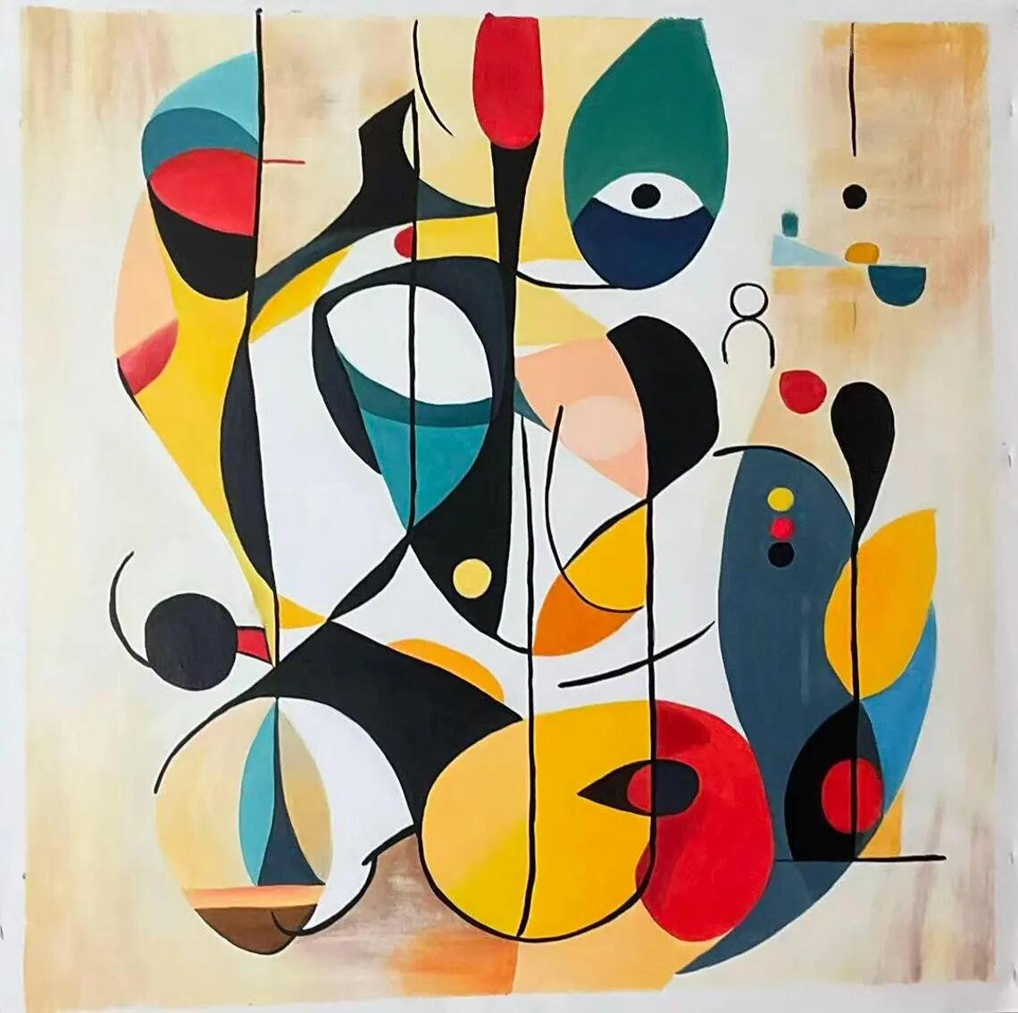
Listed by BloomBrushArtworks on Etsy, the piece is presented as an original abstract painting on stretched canvas, with a geometric vocabulary of bold colors, playful forms, and energetic lines. The listing describes the work as inspired by masters such as Wassily Kandinsky and positions it within a mid-century modern aesthetic. It is also offered in multiple size options, with custom sizing available.
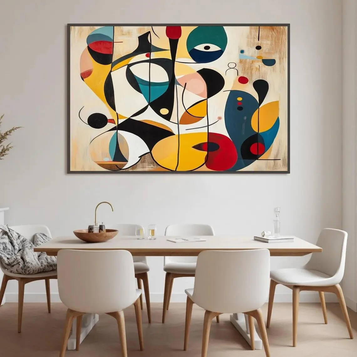
What makes the painting particularly interesting from an interior-design perspective is its ability to function as both artwork and visual structure. Rather than relying on a single dominant motif, it brings together circles, curves, blocks of color, and contrasting shapes to create a composition that feels active without being tied to a literal subject.
What Makes This Piece Stand Out?
The first impression comes from color.
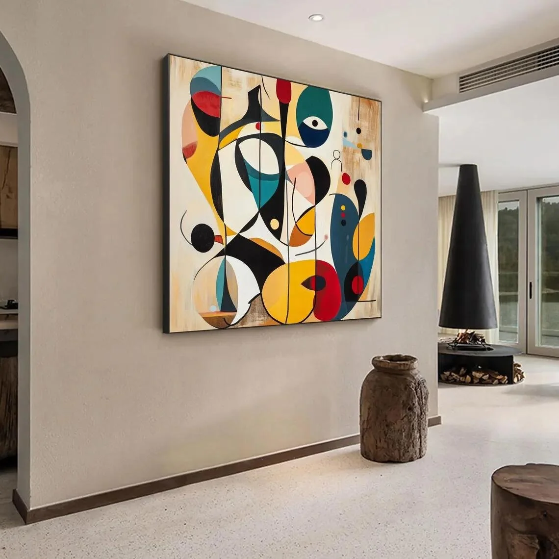
The composition combines strong primary and secondary tones—particularly yellow, red, blue, teal, green, black, and warm neutral areas—against a lighter background. The result is a palette with considerable visual variety, but the painting avoids becoming visually flat because the colors are distributed through different shapes and directional movements. The listing's images show curved forms, circular elements, angular blocks, and sweeping lines interacting across the canvas.
From an editorial point of view, this is where the painting gets much of its character. It does not depend on a traditional landscape, portrait, or botanical subject. Instead, the eye moves around the surface, finding relationships between shapes and colors.
The composition also has a pleasing tension between geometry and gesture. Some elements feel carefully structured, while others appear more fluid and expressive. That combination gives the artwork an energetic quality that can make a large wall feel more purposeful.
The seller specifically describes the work as a geometric abstract painting inspired by Kandinsky, and that influence is easy to understand in the emphasis on shapes, color relationships, and visual rhythm.
The Materials and Craftsmanship
The listing identifies stretched canvas as the surface and states that the paintings are created using oil and acrylic paints. It also describes the works as handcrafted with a palette knife technique, producing a textured, three-dimensional effect.
That information matters because texture changes the way a colorful abstract painting behaves under light. A completely flat printed surface tends to distribute color evenly, while visible paint texture can introduce subtle highlights and shadows as illumination moves across the artwork.
Here, the palette-knife approach is especially relevant to the visual language of the piece. The painting is already built around expressive marks and contrasting forms, so texture can reinforce that sense of movement rather than simply decorating the surface.
The seller also notes that because the paintings are hand-painted, slight differences may occur between the displayed image and the finished artwork.
That is worth keeping in mind when considering the piece as an original artwork: the appeal is not necessarily perfect visual uniformity, but the character that comes from a handcrafted process.
How It Works With Different Interior Styles
This painting has enough personality to work particularly well in interiors that treat wall art as part of the room's visual identity.
Contemporary Interiors
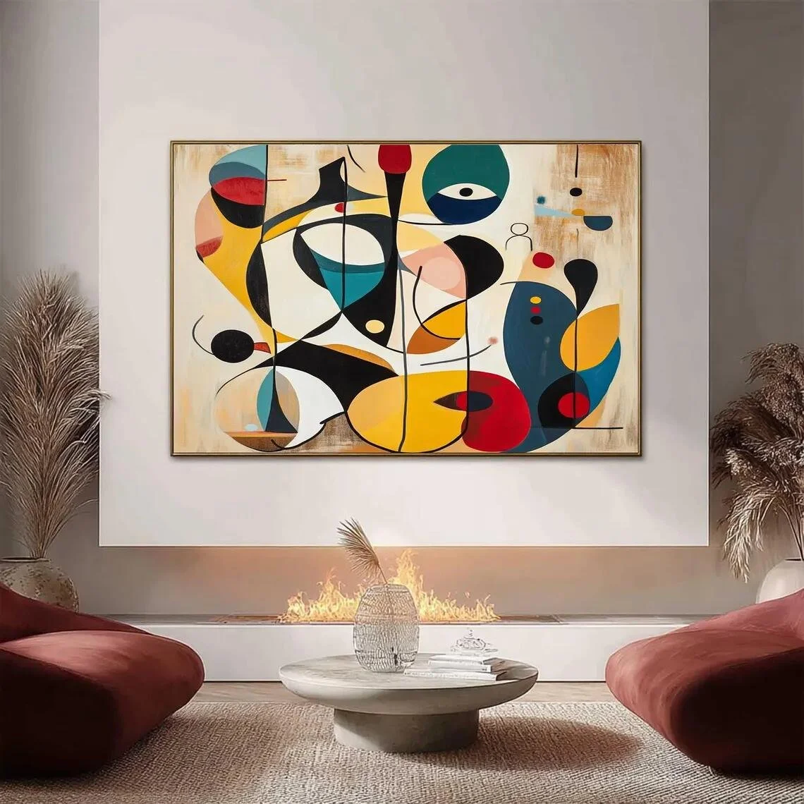
A contemporary living room with a restrained sofa, clean-lined furniture, and a neutral architectural backdrop could provide an ideal setting. In this kind of space, the artwork can introduce color without requiring the rest of the room to compete with it.
A palette of warm white, beige, charcoal, or soft gray would allow the painting's brighter elements to become the focal point.
Mid-Century Modern
This is arguably one of the most natural stylistic pairings, given the listing's own mid-century modern positioning.
The geometric shapes and saturated colors can sit comfortably alongside walnut-toned furniture, simple silhouettes, curved seating, and vintage-inspired lighting. The key is restraint: a few carefully chosen mid-century elements will support the artwork better than a room overloaded with retro references.
Modern Eclectic
For a more expressive interior, the painting can become one part of a broader mix of shapes, materials, and colors. It could work with sculptural furniture, ceramics, patterned textiles, or a carefully selected collection of decorative objects.
Here, the goal is not to match every color exactly. Instead, choose two or three tones from the artwork and allow them to appear subtly elsewhere in the room.
Minimalist Spaces
A minimalist room can also benefit from a work this energetic, provided the surrounding environment remains quiet.
Against a largely neutral wall, the painting becomes a deliberate burst of color. This approach can be especially effective when the room contains simple furniture and plenty of negative space.
Where Could You Display It?
Living Room
The living room is one of the most obvious placements, and the listing itself presents the work as suitable for a living-room setting.
Because the composition is visually active, it works best above a sofa, console, or another relatively calm architectural zone. Give the painting enough breathing room so that its shapes remain legible rather than competing with shelves, mirrors, or heavily decorated surfaces.
Home Office
This could also be an appealing choice for a home office. Abstract geometric art can introduce energy into a workspace without imposing a literal narrative.
Placed behind a desk or on a wall visible during the working day, its changing arrangement of forms gives the eye something to return to during pauses from the screen.
Entryway
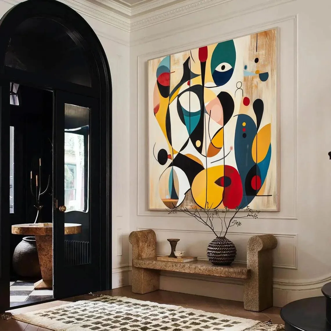
A large entryway can benefit from artwork that establishes the mood of the home immediately. In this case, the vivid palette offers a more expressive introduction than a conventional neutral piece.
The surrounding furniture can remain simple—a narrow console, understated lamp, and perhaps one or two sculptural accessories—to keep the artwork in focus.
How to Style It
The easiest way to style a colorful abstract painting like this is to avoid trying to reproduce the entire palette throughout the room.
Instead, identify a few anchor colors.
A neutral sofa can be paired with one or two cushions that echo a red, teal, mustard, or blue detail from the painting. A rug can remain comparatively quiet, while a ceramic object or small decorative accessory can repeat one accent color.
The wall behind the artwork matters just as much. Warm white and pale neutral walls allow the colors to feel especially crisp, while deeper neutral tones can create a more dramatic atmosphere.
Lighting should also be considered. Soft, directional lighting can reveal the surface texture described by the seller and create subtle changes across the painted marks. Avoid placing strong reflections directly across the canvas, particularly if the surface has pronounced texture.
Because the painting contains so many contrasting elements, surrounding it with visual breathing room is equally important. Negative space acts almost like a frame, helping the composition feel intentional rather than overwhelming.
Who Is This Piece For?
This artwork is likely to appeal to someone who enjoys color, movement, and abstraction more than literal representation.
It may suit a homeowner who wants the walls to carry some personality, particularly someone drawn to geometric art, modernist influences, or colorful contemporary interiors. It can also make sense for viewers who appreciate the relationship between art and furniture rather than treating a painting as an isolated decorative object.
The strongest match is probably not someone searching for a quiet, monochromatic accent. This is a piece for an interior where a wall can have a voice.
At the same time, its neutral background and recognizable geometric structure give the work enough organization to remain adaptable. It does not have to dictate every design decision in the room.
Final Thoughts
The appeal of this colorful abstract painting lies in its balance between structure and spontaneity.
Its geometric forms create an underlying sense of order, while the strong colors, curves, and expressive marks keep the composition lively. The handcrafted palette-knife technique described by the seller adds another layer of visual interest, particularly for viewers who value the physical character of painted surfaces.
Rather than functioning simply as a splash of color, the piece can become a visual anchor around which a room is organized. In a contemporary, mid-century modern, eclectic, or carefully restrained minimalist setting, it has the potential to introduce energy without requiring the surrounding decor to become equally bold.
And perhaps that is the most useful way to think about it: not as artwork that needs a room built around it, but as artwork capable of giving an otherwise quiet room a stronger visual identity.
Some links on this page may be affiliate links. If you make a purchase through one of these links, we may earn a small commission at no extra cost to you.
