
Original Abstract Oil Painting on Canvas: Earth-Toned Geometry for Contemporary Interiors
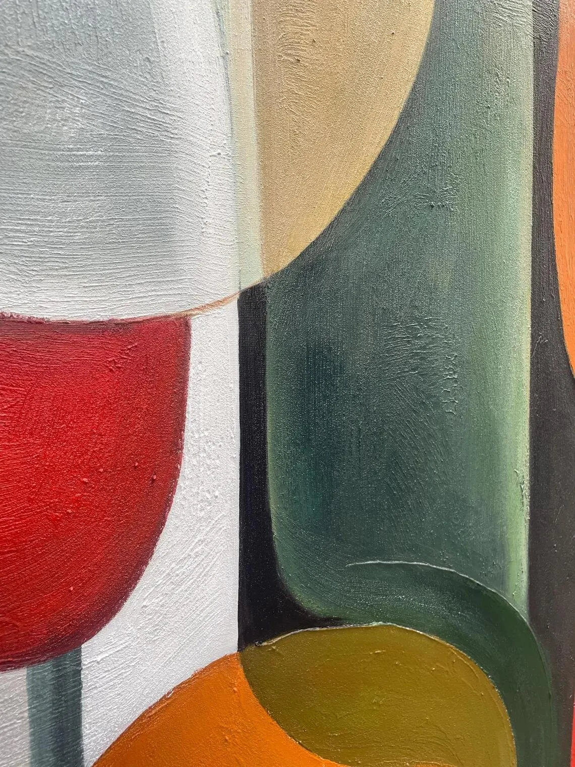
Abstract art can be remarkably effective in an interior because it does not ask a room to follow a single narrative. Instead, it introduces color, rhythm, texture, and shape—elements that can quietly influence the atmosphere of a space without dictating exactly what the viewer should see.
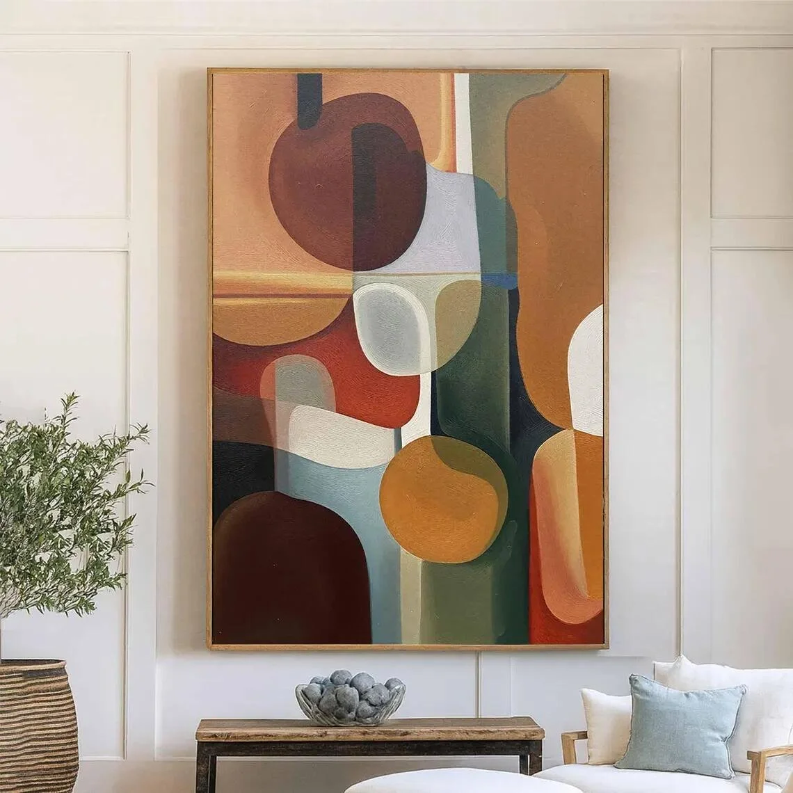
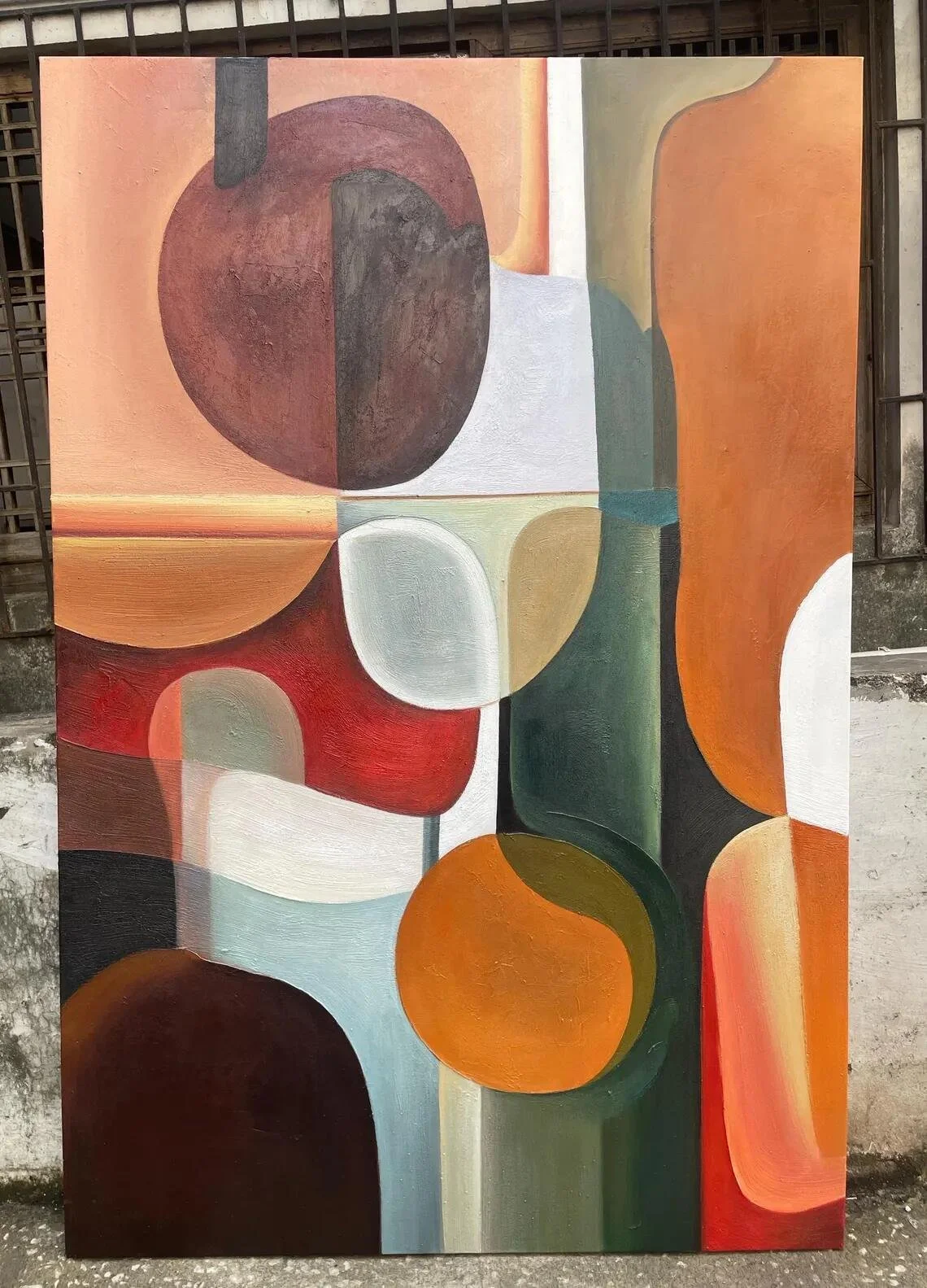
This original abstract oil painting from Etsy shop BeliteGiftHome takes that approach through a warm palette of brown, green, terracotta, and light neutral tones, arranged through rounded geometric and organic forms. The result is a composition that feels structured without becoming rigid, making it particularly interesting for contemporary interiors that lean toward natural colors and understated visual character. The listing describes the artwork as 100% hand-painted and made on canvas, with oil and acrylic painting materials listed among its materials.
What makes the piece particularly versatile is the balance between geometry and earth-inspired color. Rather than relying on dramatic contrast or highly saturated shades, the composition uses warmer, grounded tones that can connect naturally with wood, linen, stone, cream upholstery, and other tactile interior materials.
What Makes This Piece Stand Out?
The strongest feature of the painting is its visual language.
The composition is built around overlapping rounded shapes, curved boundaries, and blocks of color that create a sense of movement while retaining an overall feeling of order. In the product imagery, earthy browns and terracotta tones are paired with muted greens and lighter neutral areas. The forms appear layered rather than sharply outlined, which gives the painting a softer presence than strictly geometric artwork.
That distinction matters in interior design.
A purely geometric artwork can sometimes feel architectural or highly graphic, while an entirely organic abstract can appear loose and spontaneous. This painting sits somewhere between the two. Its shapes provide structure, but the softened edges and natural palette prevent the design from becoming visually severe.
The result is an artwork that can act as a focal point without overwhelming the rest of the room.
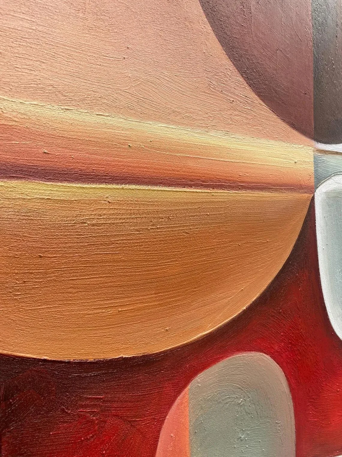
There is also an important tactile dimension to the piece. The seller describes the artwork as hand-painted and emphasizes variations in brushwork, texture, and color placement between individual pieces. Because the painting is produced by hand rather than reproduced as a print, those variations become part of its character.
The Materials and Craftsmanship
The listing identifies the materials as canvas painting, oil painting, and acrylic painting. It also describes each artwork as 100% hand-painted, created by a professional artist rather than produced as a printed reproduction.
That handmade process is especially relevant when looking at an abstract work.
In a photographic print, every line and color placement is fixed. Here, the artist's brushwork contributes directly to the final appearance. The seller explicitly notes that completed paintings may differ slightly from the reference image in brushwork, texture, and the positioning of colors.
For an interior enthusiast, that is an appealing characteristic because the artwork retains a sense of physical individuality. It is not simply a graphic image transferred onto canvas.
The listing also offers multiple size and display configurations, including unstretched and framed options, with frame choices shown in gold, black, silver, and white. Custom colors and certain design adjustments are also offered according to the seller's description.
How It Works With Different Interior Styles
This painting has the strongest relationship with interiors that value warm neutrals, natural materials, and contemporary forms.
Contemporary
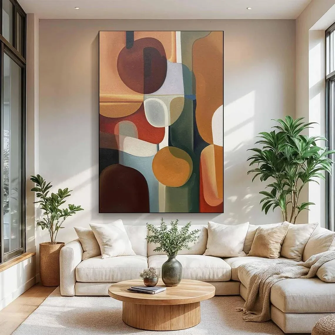
In a contemporary living room, the artwork can soften a more restrained furniture arrangement. Imagine a cream sofa, a low-profile wood coffee table, and a few sculptural accessories against a relatively quiet wall. The painting introduces enough shape and color to give the room personality without relying on excessive decoration.
Modern
Modern interiors often benefit from artwork that creates contrast without introducing visual clutter. The combination of geometric forms and earthy colors makes this piece a natural candidate for a space featuring clean-lined furniture, neutral upholstery, and restrained accessories.
A black or white frame could emphasize the more architectural side of the composition, while a warmer frame treatment may allow the terracotta and brown tones to blend more closely with surrounding materials.
Organic Modern
This is perhaps one of the most natural stylistic matches.
Organic-modern interiors often combine contemporary silhouettes with materials and colors inspired by nature. The painting's browns, greens, terracotta tones, and softer rounded shapes can echo wood grain, stone, ceramics, woven textiles, and indoor greenery without becoming literal botanical artwork.
Japandi
A carefully edited Japandi interior could also accommodate this piece, particularly when the rest of the room is kept visually calm. Rather than surrounding the painting with numerous accessories, let it occupy a relatively quiet wall and allow the earthy palette to connect with oak, beige, soft gray, and natural textiles.
Boho and Warm Minimalism
The artwork can also work in a warmer, more expressive interpretation of minimalist or bohemian interiors. Its organic colors give a room more depth while avoiding the highly saturated palette that can dominate some eclectic spaces.
Where Could You Display It?
The living room is an obvious setting, especially above a neutral sofa or on a large uninterrupted wall where the composition can be appreciated from a distance. The product imagery itself presents the artwork in living-room environments, including arrangements with light upholstery and wood furniture.
A dining area could be another strong option. The terracotta and brown tones can complement warm wood dining tables, ceramic tableware, woven textures, and soft ambient lighting. In this setting, the artwork can help make the dining area feel considered without introducing unnecessary visual noise.
The piece could also be effective in a home office, particularly one designed around natural wood, neutral walls, and muted green accents. The abstract composition provides visual interest during breaks without introducing a literal subject that competes with the work environment.
An entryway is another possibility when there is sufficient wall width. In that context, the artwork can establish the home's visual language from the moment someone enters, especially when paired with a simple console, a ceramic vessel, and carefully chosen lighting.
How to Style It
The easiest way to style this artwork is to treat its palette as a bridge between the major colors already present in the room.
Start with the neutral background. Warm white, ivory, beige, light taupe, or soft greige walls can give the painting enough contrast while keeping the atmosphere cohesive.
From there, repeat one or two of the painting's accent tones elsewhere in the room rather than trying to reproduce every color. An olive or muted green cushion might echo the artwork without making the space feel overly coordinated. Terracotta can appear subtly in ceramics, textiles, or a small decorative object. Natural brown tones can be reinforced through oak, walnut, leather, or woven materials.
The furniture does not need to compete with the composition. In fact, simpler silhouettes are likely to work better. A restrained sofa, low wooden table, sculptural chair, or clean-lined sideboard can provide the visual breathing room the artwork needs.
Lighting also matters. Soft, warm illumination can bring greater depth to the earthy palette, while strong, cool lighting may make the colors appear harder and less atmospheric.
Most importantly, avoid filling the wall around the artwork simply because there is available space. The rounded shapes and layered color already provide visual information. Giving the painting some negative space can make it feel more intentional.
Who Is This Piece For?
This artwork may appeal particularly to someone who enjoys abstract art but prefers it to remain connected to the natural world through color.
It could suit a homeowner who likes contemporary interiors but finds stark monochromatic artwork too cold. It may also appeal to someone who prefers earthy palettes, softened geometry, and decorative pieces that can interact with furniture and materials rather than simply dominate a room.
Another interesting aspect is the handmade nature of the work. The seller notes that each painting is created especially for the customer and that minor differences in brushwork, texture, and color placement are expected.
That makes the appeal less about obtaining a perfectly uniform reproduction and more about owning a hand-painted interpretation of the composition.
Final Thoughts
This abstract painting is at its most convincing when viewed as a meeting point between geometry and organic color.
Its warm brown, terracotta, green, and neutral palette gives it an approachable presence, while the layered rounded forms add enough complexity to reward closer attention. The hand-painted process further reinforces the tactile quality of the piece and means that subtle variations are naturally part of the finished artwork.
For interiors built around natural materials, warm neutrals, and contemporary furniture, the painting has considerable flexibility. It can become a focal point above a sofa, introduce warmth to a dining space, or add visual rhythm to a quieter home office.
Rather than demanding attention, it has the potential to hold it—quietly, through color, shape, and texture.
Some links on this page may be affiliate links. If you make a purchase through one of these links, we may earn a small commission at no extra cost to you.
