
Woven Silence: The Quiet Tension of Textured Abstract Art
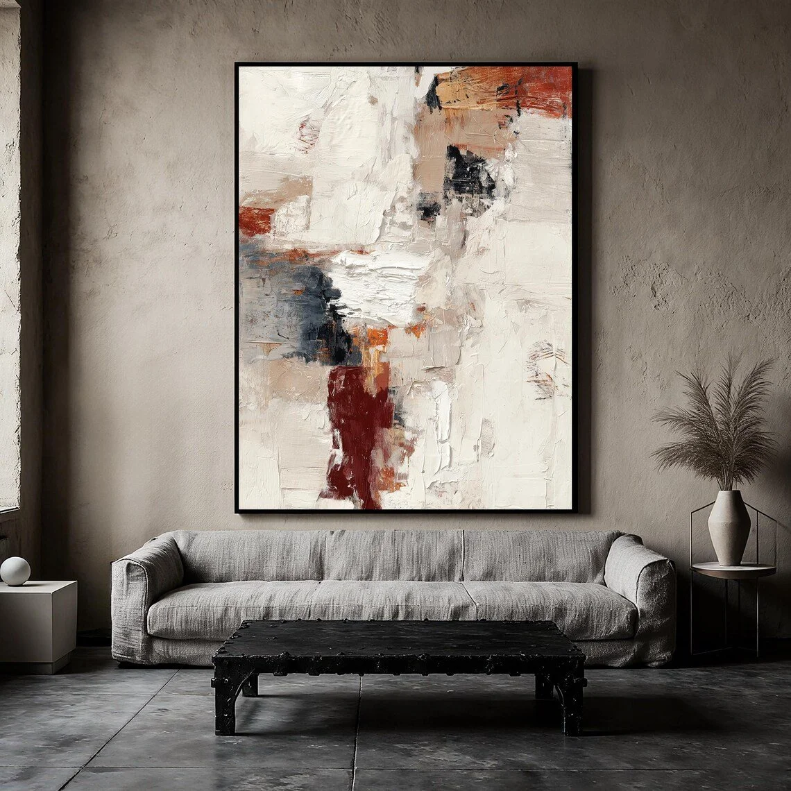
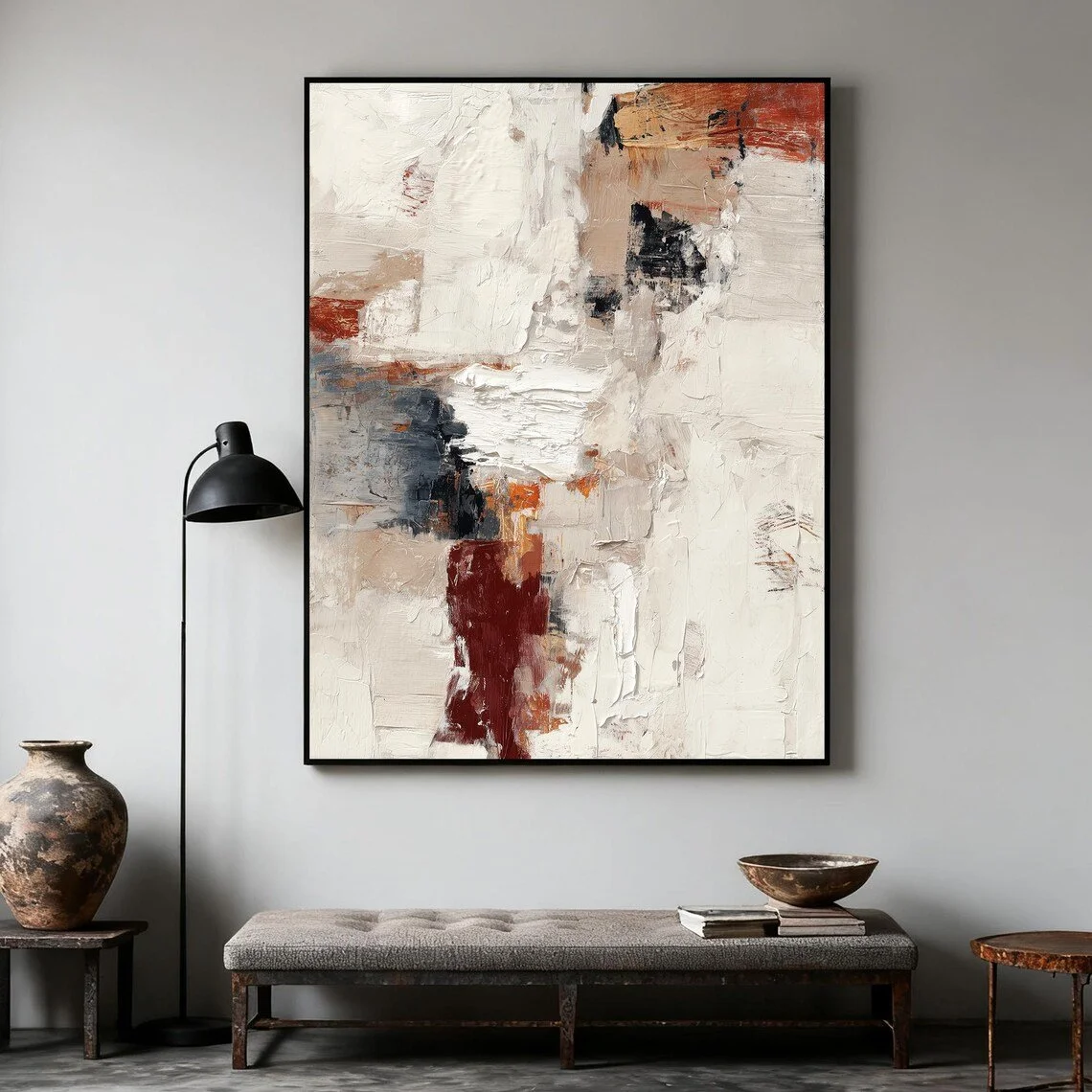
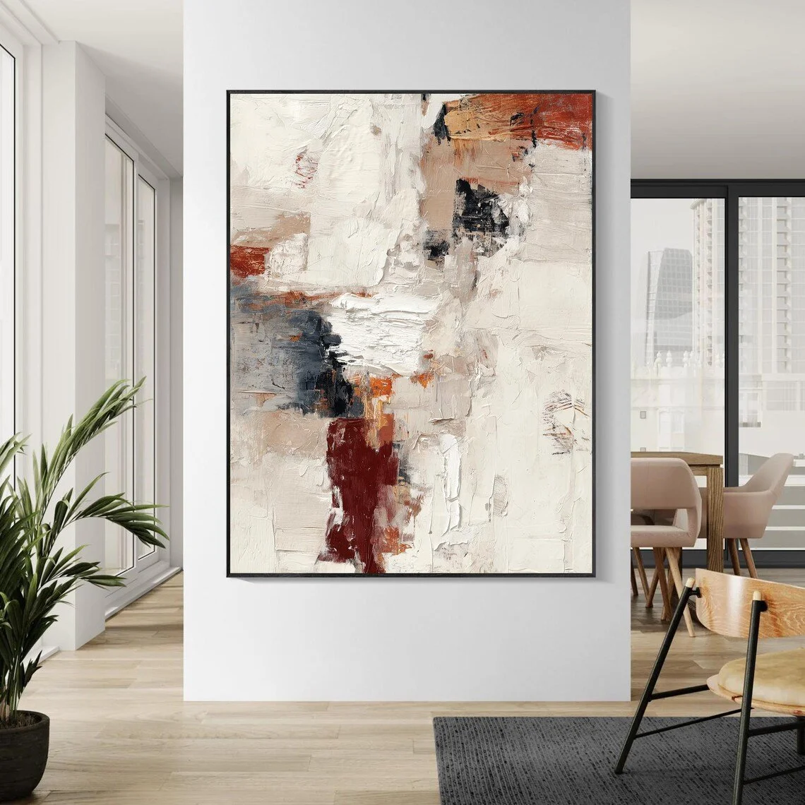
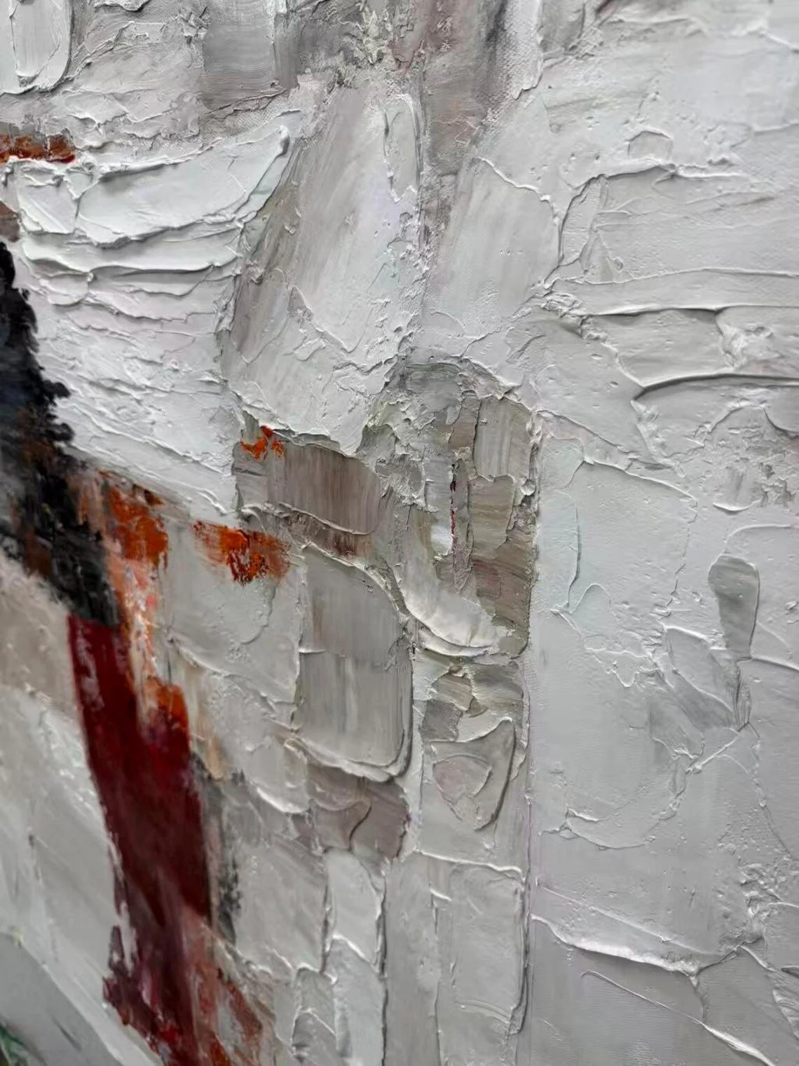
There is a particular kind of abstract painting that does not rely on a single recognizable subject to hold attention. Instead, it works through texture, contrast, rhythm, and the subtle tension between colors. “Woven Silence” belongs to that category: an abstract oil painting built around a restrained neutral foundation and interrupted by deeper, warmer accents.
The artwork is presented by Etsy shop StunningWallArt66 as an original, hand-painted piece on cotton canvas. According to the listing, it combines beige, ivory, and stone gray with touches of burnt sienna, black, and deep wine red, while a thick impasto surface created with palette knives gives the composition a pronounced physical presence. The seller describes each work as one-of-a-kind, with custom sizing and framing options available. (Etsy)
What makes the piece particularly interesting from an interior-design perspective is the balance between restraint and intensity. Most of its visual field remains relatively quiet, allowing the darker and warmer passages to act almost like punctuation marks across the surface.
What Makes “Woven Silence” Stand Out?
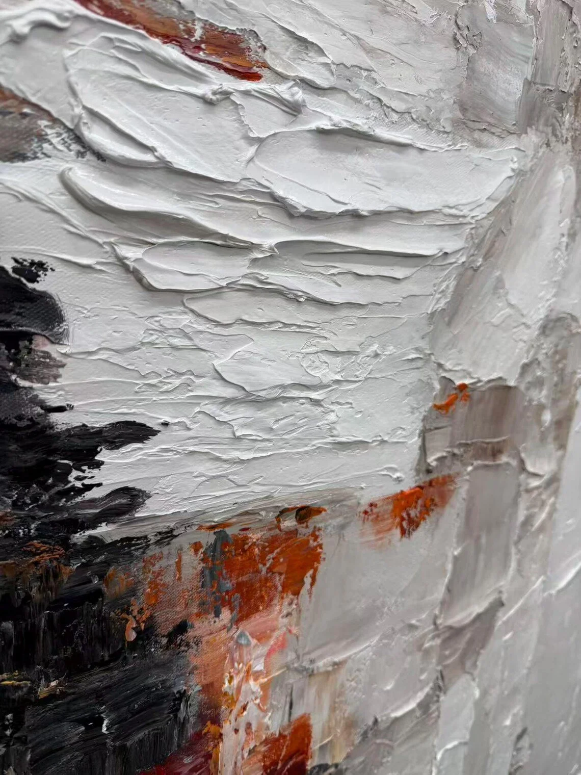
The first thing that defines this painting is texture.
Rather than presenting a completely flat abstract composition, the artwork uses heavy layers of paint to create raised areas, grooves, ridges, and irregular transitions. The listing identifies the technique as thick impasto created with palette knives, which gives the surface a sculptural quality as well as a painterly one. (Etsy)
That physical quality changes the way the artwork behaves in a room. From across the space, the painting reads primarily as a composition of color and shape. From closer range, the surface becomes much more active, revealing the accumulated movement of the paint.
The palette is equally important. The dominant beige, ivory, and stone-gray tones keep the composition grounded and relatively calm, while burnt sienna, wine red, and black introduce stronger visual weight. (Etsy)
This contrast prevents the neutrals from becoming monotonous. The painting is quiet, but not passive.
Visually, there is also an appealing tension between large areas of pale color and concentrated darker passages. That makes the composition especially interesting in interiors where the surrounding décor is intentionally edited rather than highly decorative.
The Materials and Craftsmanship
The Etsy listing identifies the materials as canvas, oil painting, and acrylic painting, while the main description states that the artwork is hand-painted on cotton canvas and that the impasto texture is created using palette knives. (Etsy)
The seller also describes the work as 100% hand-painted and one-of-a-kind, emphasizing that it is not a print or replica. Custom sizes and framing are available, which gives the artwork some flexibility when considering the proportions of a particular wall. (Etsy)
That distinction matters when thinking about abstract art as part of an interior. A heavily textured original painting has more visual irregularity than a photographic reproduction or flat printed artwork. Those small variations can help a room feel less assembled and more layered.
The listing also notes that framed versions can be hung directly, while unstretched versions are rolled for delivery and require stretching and framing after arrival. (Etsy)
How It Works With Different Interior Styles
“Woven Silence” has enough visual structure to anchor a contemporary room, but its neutral foundation prevents it from being restricted to one decorating vocabulary.
Modern and Contemporary
This is perhaps the most natural setting for the work.
Clean-lined furniture, restrained accessories, and generous areas of negative space would allow the painting to become the room's main visual event without making the space feel overcrowded.
A pale sofa, low-profile coffee table, dark metal accents, and one or two pieces of sculptural décor could create a strong relationship with the painting without competing with it.
Organic Modern
The warm earthy accents in the composition make the painting particularly interesting alongside natural materials such as oak, walnut, linen, stone, and ceramics.
The combination of warm wood and pale textiles can soften the darker passages of the artwork, while the painting introduces just enough contrast to keep the room visually engaging.
Industrial
The black and deep red passages lend themselves well to an industrial environment where metal, concrete-like surfaces, darker woods, and restrained lighting are already part of the palette.
Rather than trying to brighten such a room completely, the artwork could reinforce its existing character while introducing softer beige and ivory notes.
Minimalist Interiors
Minimalist does not have to mean completely empty or colorless. In fact, a textured abstract painting can be an effective way to add complexity without introducing multiple decorative objects.
Placed on an otherwise quiet wall, “Woven Silence” could provide the visual variation that a minimalist room needs while maintaining a relatively disciplined color palette.
Where Could You Display It?
The artwork appears particularly well suited to spaces where a single large composition can command attention.
Living Room
A living room is one of the strongest possibilities, especially when the painting is positioned above a sofa or on a broad uninterrupted wall.
The neutral portions can echo cream, taupe, gray, or beige upholstery, while the burnt sienna and wine-red details can be repeated subtly through a cushion, ceramic object, or small accent chair.
The key is restraint. Because the painting already contains several layers of color and texture, the furniture around it does not need to perform the same role.
Bedroom
The piece can also work in a bedroom, especially one built around warm neutrals.
Here, the darker elements of the painting could be balanced with soft bedding, natural fabrics, warm bedside lighting, and uncomplicated furniture. The result would feel more atmospheric than energetic.
A particularly effective approach would be to let the painting provide the room's strongest contrast while keeping everything else relatively soft.
Dining Room
A dining room offers another interesting possibility. The earthy tones can work naturally beside wood furniture, while the stronger red and charcoal details provide a visual counterpoint to otherwise neutral surroundings.
The painting could become a backdrop behind a dining table without requiring a large collection of additional wall décor.
Entryway
An entryway benefits from artwork that communicates character quickly. Because “Woven Silence” combines a calm base with stronger, concentrated accents, it can create an immediate focal point without depending on a literal subject.
This is especially useful in a contemporary hallway where furniture may be limited and the artwork needs to carry more of the visual identity.
How to Style It
The easiest approach is to treat the painting as a color reference, rather than attempting to match every shade exactly.
Start with a neutral foundation: ivory, warm white, sand, beige, taupe, or soft gray. These colors relate naturally to the lighter areas of the composition.
Then introduce one or two of the artwork's stronger tones elsewhere in the room. A muted rust cushion, dark burgundy textile, charcoal lamp, or warm brown wooden surface can establish a connection without making the décor feel overly coordinated.
Lighting also matters.
Because the painting has substantial surface texture, directional or angled light can reveal its raised paintwork more effectively than completely flat illumination. Natural daylight can emphasize subtle variations in the pale passages, while warm evening lighting may bring out the earthy and darker tones.
Perhaps the most important styling decision is what not to add. A heavily textured abstract painting already contains a great deal of visual information. Surrounding it with many similarly expressive artworks or decorative objects could dilute its impact.
Give it room to breathe.
The presentation images on the listing also show the artwork with dark, narrow framing in some configurations, while the listing offers framed and unframed choices. The available framing options should therefore be considered part of the overall visual composition rather than treated as an afterthought. (Etsy)
Who Is This Piece For?
“Woven Silence” may appeal most to someone who enjoys abstract art with physical presence rather than purely graphic or decorative abstraction.
It could be especially appealing to interiors where the owner wants artwork to contribute atmosphere without introducing a recognizable landscape, figure, or narrative subject.
It also suits people who appreciate a controlled palette but do not want a room to feel completely understated. The painting offers both qualities at once: much of its visual language is quiet and neutral, yet its deeper accents and heavily worked surface prevent it from disappearing into the background.
In that sense, it occupies an interesting middle ground. It is expressive without becoming visually chaotic, and neutral without becoming bland.
Final Thoughts
The appeal of “Woven Silence” lies less in any single color than in the relationship between its elements.
The pale beige, ivory, and stone-gray foundation creates calm. The burnt sienna, deep wine red, and black introduce tension. The thick impasto surface adds another dimension, making the artwork something to experience not only as an image but also as a textured object. The result is an abstract composition that can hold its own on a large wall while still giving surrounding furniture and materials room to contribute. (Etsy)
Its strongest interiors are likely to be those that understand the value of restraint: warm neutrals, natural materials, clean silhouettes, thoughtful lighting, and enough open space for the painting's texture to remain visible.
For anyone drawn to original abstract wall art that combines a calm neutral palette with expressive bursts of darker color, this piece offers an intriguing example of how texture can become one of the defining architectural elements of a room.
Some links on this page may be affiliate links. If you make a purchase through one of these links, we may earn a small commission at no extra cost to you.
