
Geisha Portrait Art Print: A Contemporary Take on Japanese-Inspired Wall Art
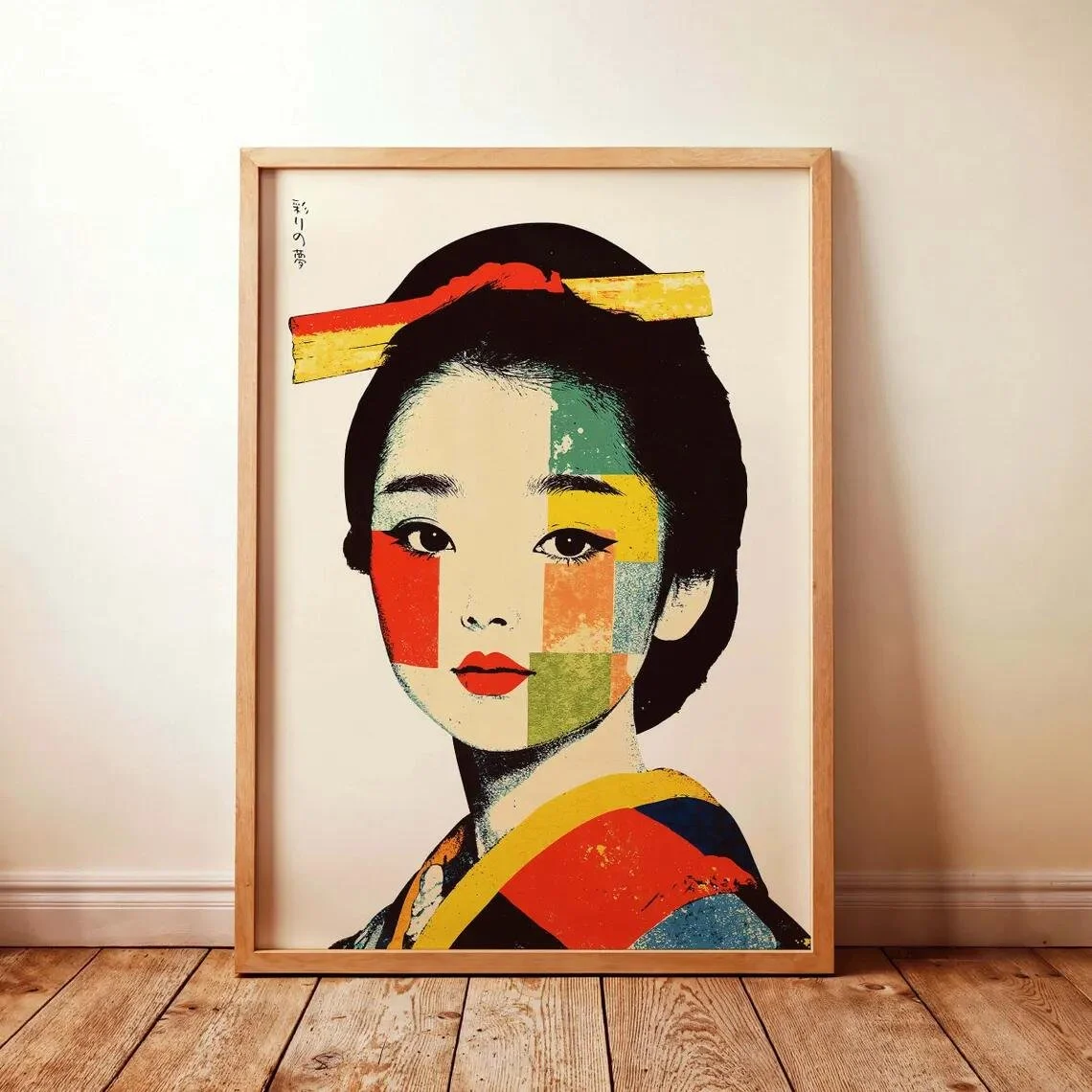
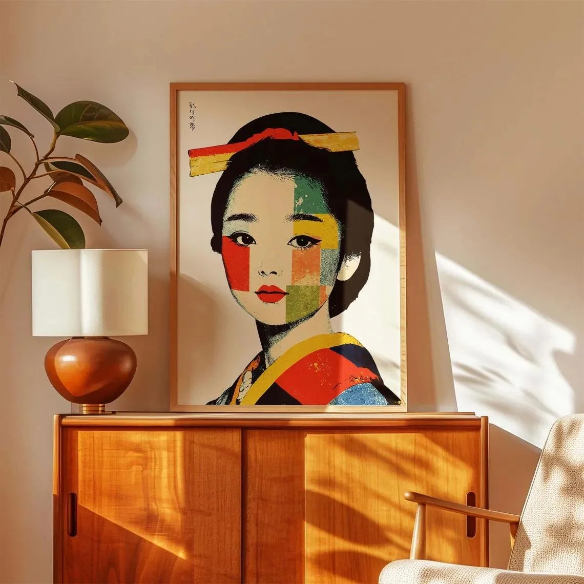
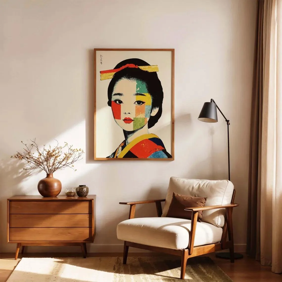
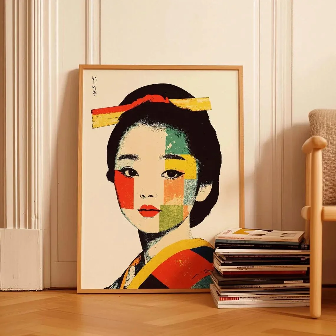
There is something especially compelling about portrait art when it manages to feel both graphic and contemplative at the same time. This Geisha Portrait Art Print from adagioArtLab takes that approach through a distinctly contemporary composition, bringing together a Japanese-inspired female portrait, simplified geometric shapes, and an unusually vivid palette. The result is less like a conventional historical portrait and more like a modern decorative interpretation of Japanese visual culture.
The Etsy listing identifies the piece as an unframed art print designed by adagioArtLab and printed on paper. The seller describes it as a Giclée print on heavyweight 200gsm matte fine-art paper using archival inks. It is offered in multiple size options, while framing is not included with the listed product. (Etsy)
Visually, the artwork stands out because of the contrast between its restrained portrait structure and its energetic blocks of color. The face remains the focal point, while red, yellow, green, black, and warm neutral tones create a graphic rhythm around it. The combination makes the print particularly interesting for interiors where artwork is expected to contribute personality rather than simply fill an empty wall.
What Makes This Piece Stand Out?
The strongest element of the print is its graphic treatment of the portrait.
Rather than presenting the geisha figure as a highly detailed, traditional painting, the composition uses simplified areas of color and bold contours. The woman's face is positioned prominently in the upper and central portion of the artwork, immediately establishing a clear visual anchor. Her dark hair and red lips provide strong contrast against the lighter background, while the colorful facial and clothing elements introduce an almost poster-like quality.
That contrast is what gives the piece its contemporary character.
The image also makes effective use of negative space. The pale background surrounding the portrait prevents the stronger colors from becoming visually overwhelming. Instead of creating a dense composition, the artwork allows the eye to move between the face, hair ornament, clothing, and surrounding shapes.
From an interior-design perspective, that matters. A wall artwork with this level of color can easily dominate a room if the composition is too busy. Here, the relatively open background creates enough visual breathing room to make the print more adaptable.
The artwork's warm wood-toned presentation in the listing images also demonstrates how naturally it can sit within a simple, contemporary setting, although the product itself is sold unframed. (Etsy)
The Materials and Printing Approach
The physical product is described by the seller as a paper art print, produced using Giclée printing on 200gsm enhanced matte fine-art paper with archival-grade inks. The listing also notes sustainably sourced paper, water-based inks, and plastic-free, recyclable packaging. (Etsy)
That matte surface is particularly relevant to this artwork.
A highly reflective finish could introduce glare across the large areas of pale background and make the graphic color fields harder to appreciate under interior lighting. A matte presentation, by contrast, is likely to preserve the softer visual relationship between the neutral background and the more saturated reds, greens, yellows, and blacks.
The seller describes the print as made to order, with production handled through production partners in the UK, EU, and US. Smaller sizes are shipped flat, while larger formats are rolled in tubes. (Etsy)
The important distinction is that this is an art print rather than an original painting, handmade artwork, or one-of-a-kind physical piece. Nothing on the listing indicates that it is a limited edition or original work, so those labels would not be appropriate here.
A Contemporary Interpretation of Japanese-Inspired Art
One of the most interesting qualities of the piece is the way it balances recognizable Japanese-inspired imagery with contemporary graphic design.
The subject immediately evokes the visual language associated with the geisha, but the treatment is noticeably modern. Strong color blocks replace some of the subtle tonal modeling associated with traditional portrait painting, and the clothing becomes part of the overall graphic structure rather than simply functioning as historical costume.
That makes the work easier to introduce into a modern home.
It does not require an interior filled with explicitly Japanese furniture or traditional objects. Instead, it can work as a visual accent within a room that simply appreciates Japanese-inspired restraint, stylized portraiture, or bold decorative art.
For that reason, Japandi is a particularly natural editorial pairing. Japandi interiors often depend on a controlled mix of natural materials, understated backgrounds, and carefully chosen statement pieces. The print can introduce color and character without requiring the entire room to become heavily themed.
It could also sit comfortably within contemporary, minimalist, or eclectic interiors, particularly where the surrounding palette is quieter.
How It Works With Different Interior Styles
Japandi
This is arguably one of the most convincing settings for the artwork. Place it against an off-white, warm beige, soft greige, or muted clay-colored wall and let the print provide the stronger color statement.
Natural oak, light wood, linen upholstery, woven textures, and restrained ceramics would complement the visual language without competing with it.
Contemporary
In a more contemporary interior, the print can become a deliberate graphic focal point. A clean-lined sofa, sculptural side table, and relatively uncluttered wall can give the artwork enough room to command attention.
Black accents can be especially effective because they echo the dark hair and strong outlines within the portrait.
Minimalist
Minimalism works best when the artwork is given plenty of breathing room. Rather than surrounding it with numerous decorative objects, use a single print on a relatively open wall and allow its colors to provide the personality.
Eclectic
An eclectic room can take the artwork in a more expressive direction. It could be paired with vintage-inspired furniture, colorful textiles, or collected objects, provided the surrounding elements share at least one or two tones with the print.
Where Could You Display It?
Living Room
The living room is perhaps the most obvious destination, especially above a console, sideboard, or a quieter section of wall where the portrait can be viewed at eye level.
The piece works particularly well when treated as a focal artwork rather than one component in an overly crowded gallery wall.
Bedroom
In a bedroom, its portrait orientation and relatively calm facial expression can create a more intimate atmosphere. Pairing it with warm neutrals, natural textiles, and soft lighting would emphasize its quieter side.
A simple wooden or slim black frame could make the presentation feel more intentional without overpowering the artwork itself.
Home Office
This may be one of the more interesting uses. The graphic nature of the print gives a workspace visual character without relying on conventional motivational or abstract office art.
Against a neutral wall with a wood desk, black metal details, and a few carefully selected objects, it could become a strong visual anchor.
Entryway
A smaller size could work beautifully in an entryway, especially above a narrow console. The portrait immediately creates a point of interest for guests while the surrounding neutral space keeps the first impression refined rather than cluttered.
How to Style It
The easiest way to style this print is to let its palette guide the room rather than trying to reproduce every color around it.
Warm white, cream, beige, and light wood can provide a quiet background. Black can be introduced through small details such as lighting fixtures, side tables, picture frames, or hardware. Meanwhile, the red, yellow, and green already present in the artwork can be echoed selectively through a cushion, ceramic object, book spine, or small textile.
The goal is not to create a room full of matching colors.
Instead, think of the print as the source of the room's accent palette.
Lighting also matters. Diffused daylight or warm ambient lighting will generally preserve the softer relationship between the neutral background and the stronger color fields. Because the seller notes that colors may vary depending on screen and lighting conditions, the print should be considered in the context of the actual room lighting rather than judged solely by its online appearance. (Etsy)
The choice of frame can also change the character of the piece considerably. A light wood frame would reinforce its softer Japandi direction, while a thin black frame would emphasize its graphic and contemporary qualities. Those are styling recommendations rather than frame specifications included with the listed product; the listing itself states that the artwork is sold unframed. (Etsy)
Who Is This Piece For?
This artwork is likely to appeal to someone who enjoys Japanese-inspired imagery but prefers a modern interpretation rather than a strictly traditional one.
It may also suit people who like interiors where art introduces personality through color and composition, especially when the rest of the room is relatively restrained.
The piece is less about historical authenticity and more about visual interpretation. Its appeal comes from the tension between a familiar cultural subject and a distinctly contemporary graphic language.
That makes it especially interesting for someone who wants their wall art to feel intentional without making the room look overly themed.
Final Thoughts
The Geisha Portrait Art Print by adagioArtLab is an example of how a Japanese-inspired subject can be translated into a modern decorative vocabulary. Its bold color blocking, simplified portraiture, generous negative space, and graphic structure give it a character that feels distinctly contemporary.
What makes it particularly adaptable is the balance within the composition. The portrait provides a strong focal point, but the surrounding neutral space keeps the artwork from becoming visually exhausting. That allows it to work in rooms ranging from Japandi and minimalist spaces to more expressive contemporary interiors.
It is ultimately a piece for someone who appreciates the intersection of portrait art, Japanese-inspired aesthetics, and modern graphic design—and who wants the artwork itself to bring color and identity into the room.
Some links on this page may be affiliate links. If you make a purchase through one of these links, we may earn a small commission at no extra cost to you.
